A subject that attracts ornament, given three shapes and told to manage. Fourteen years of it, unpaid.
The brief
A Moscow foundation that publishes Tibetan Buddhist philosophy in translation, runs sitting practice, and brings teachers over for seminars. Three audiences, one voice.
I have been their designer since 2012, as a volunteer, and still am. That is by a wide margin the longest relationship on this site, and it changes what the work is: nothing here was made to a brief handed over at a kick-off. The system got built in pieces, over years, by someone who also sits in the room.
Everything in this category looks the same, and the reason is that the source material is visually overwhelming: mandalas, knots, wheels, lotuses, a thousand years of ornament, all of it beautiful and all of it available. Designers reach for it because reaching for it feels respectful.
The problem is that it flattens everything into decoration, and the foundation is not selling atmosphere — it is asking people to sit down every day for thirty minutes. That is an austere proposition, and it needed an austere identity.
The idea
The practice itself names what it is trying to produce: расслабление, устойчивость, ясность — relaxation, stability, clarity. Three words that already exist in the teaching, in a fixed order, meaning three different things.
So each one gets a primitive. A triangle for relaxation — a shape that settles. A square for stability. A circle for clarity. They sit under the wordmark in that order, at that size, and nothing else in the system is ever illustrated.
The mark is those same three shapes nested: a triangle, the largest square that fits inside it, and the circle resting on the baseline within the square. Relaxation holds stability holds clarity, in the order the teaching gives them — one figure instead of three, and no ornament anywhere in it. The name sets in two weights so that «контемплативных» — the word nobody can pronounce and everybody has to read — is the one carrying the colour.
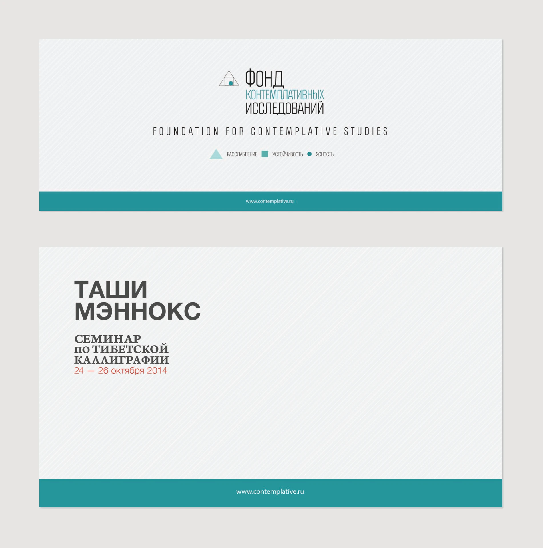
The source material is a thousand years of ornament. The answer was a triangle, a square and a circle.
The cards
The practice cards are the working end of the identity. Each is a double-sided pocket card — 60 × 100 or 65 × 95 mm — with one practice on the front and its text on the back: a daily sitting commitment at one of three durations, the four lines of the метта aspiration, a year-long pledge with the dates left blank to fill in by hand.
Colour does the sorting, because these are handed out in a room where nobody is reading labels. Maroon for the monastery community, plum for loving-kindness — and for the sitting pledge, colour is not a category at all. It is the number.
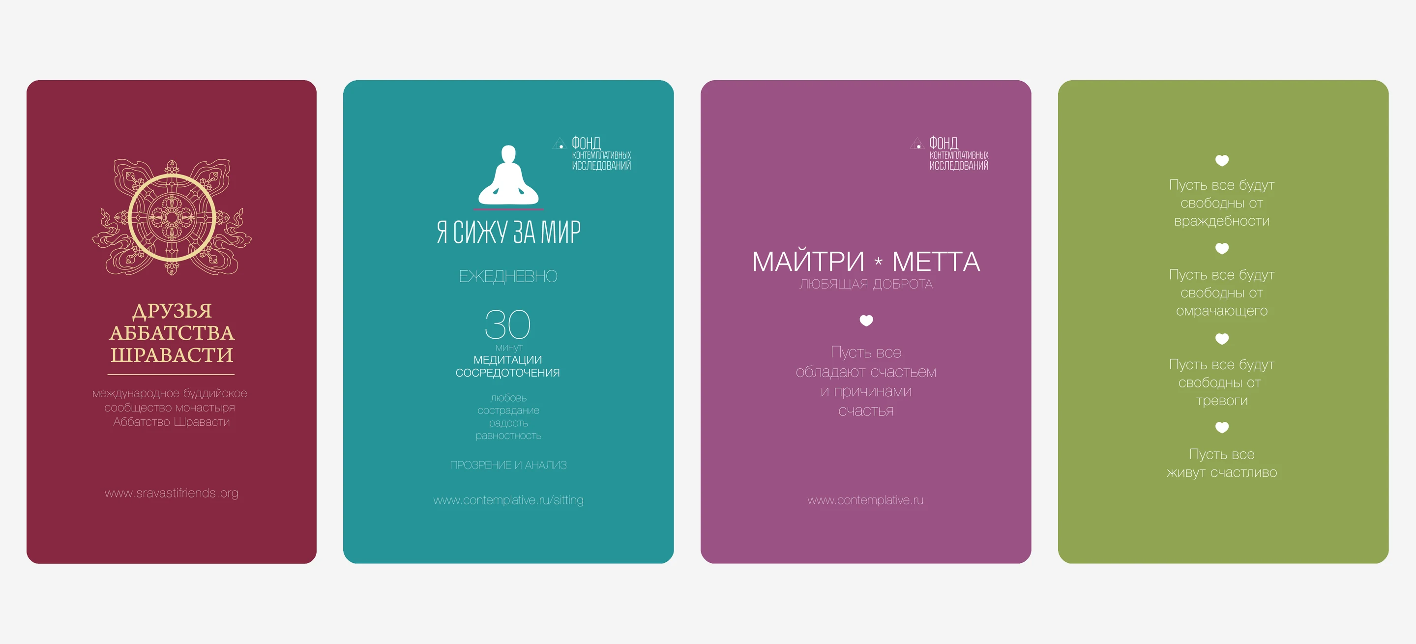
The teal card above is one of three. «Я сижу за мир» prints in olive, teal and plum for fifteen minutes, thirty and an hour — same layout, same figure, only the numeral and the ground change. Whoever hands one over picks the colour to match what the person has actually committed to, and that is the whole filing system.
The back of every card in the set is the three primitives again, at the same size, in the same order. It is the only page in the identity that is pure diagram, and it is on the side nobody designs.
The last of them is a pledge for the year, with the dates left blank to fill in by hand — the only instruction any card in the set gives.
Events
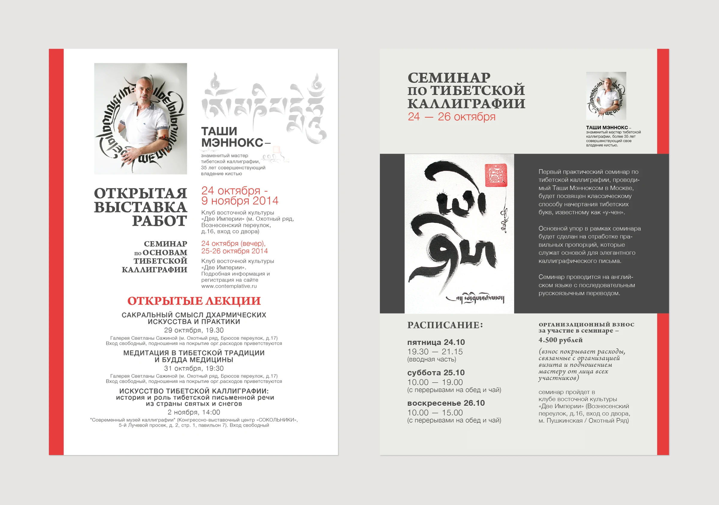
In October 2014 the foundation brought Tashi Mannox to Moscow — a calligrapher with thirty-five years on the brush — for an exhibition and a three-day seminar. The posters had to carry a dense Russian programme: four venues, six events, two ticket prices, a schedule to the quarter hour.
They also had to leave the calligraphy alone. So the type gets driven into narrow measures against a red edge, the brush drawing takes a dark panel of its own, and nothing crosses into it. The design here is mostly a decision about where not to go.
The books
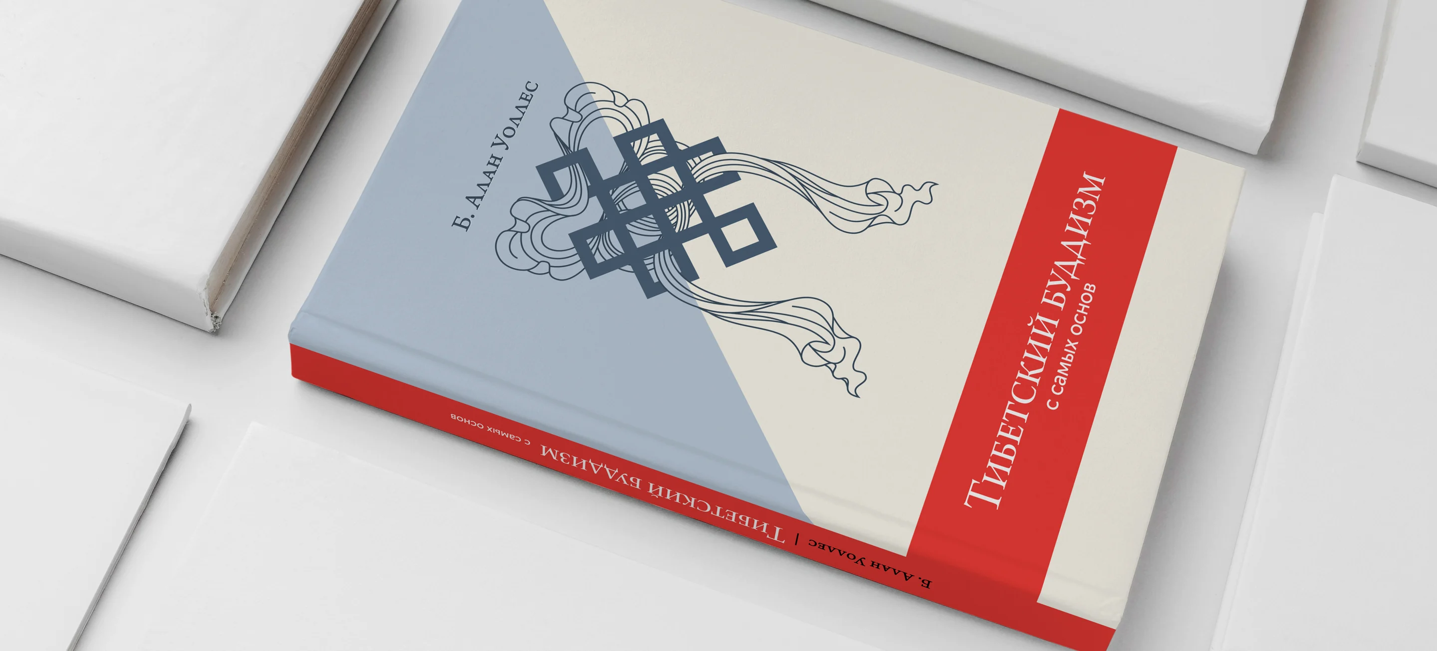
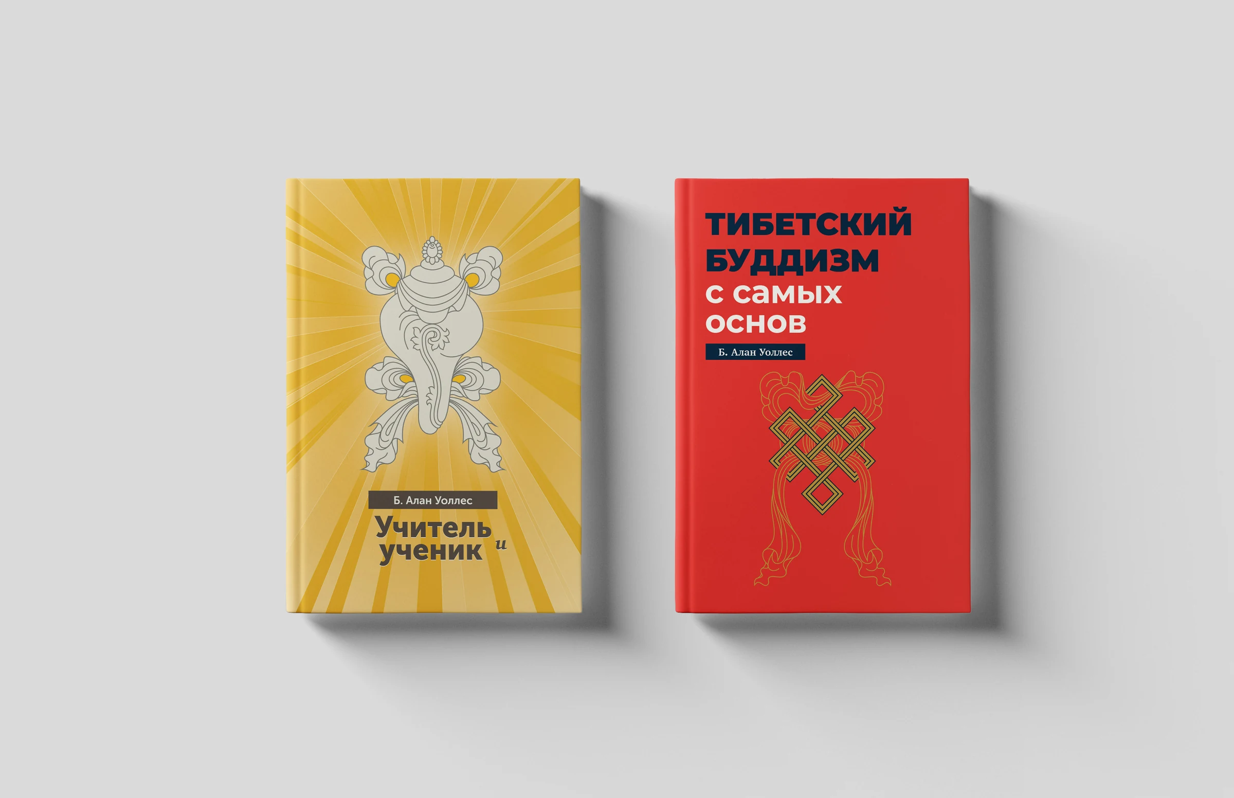
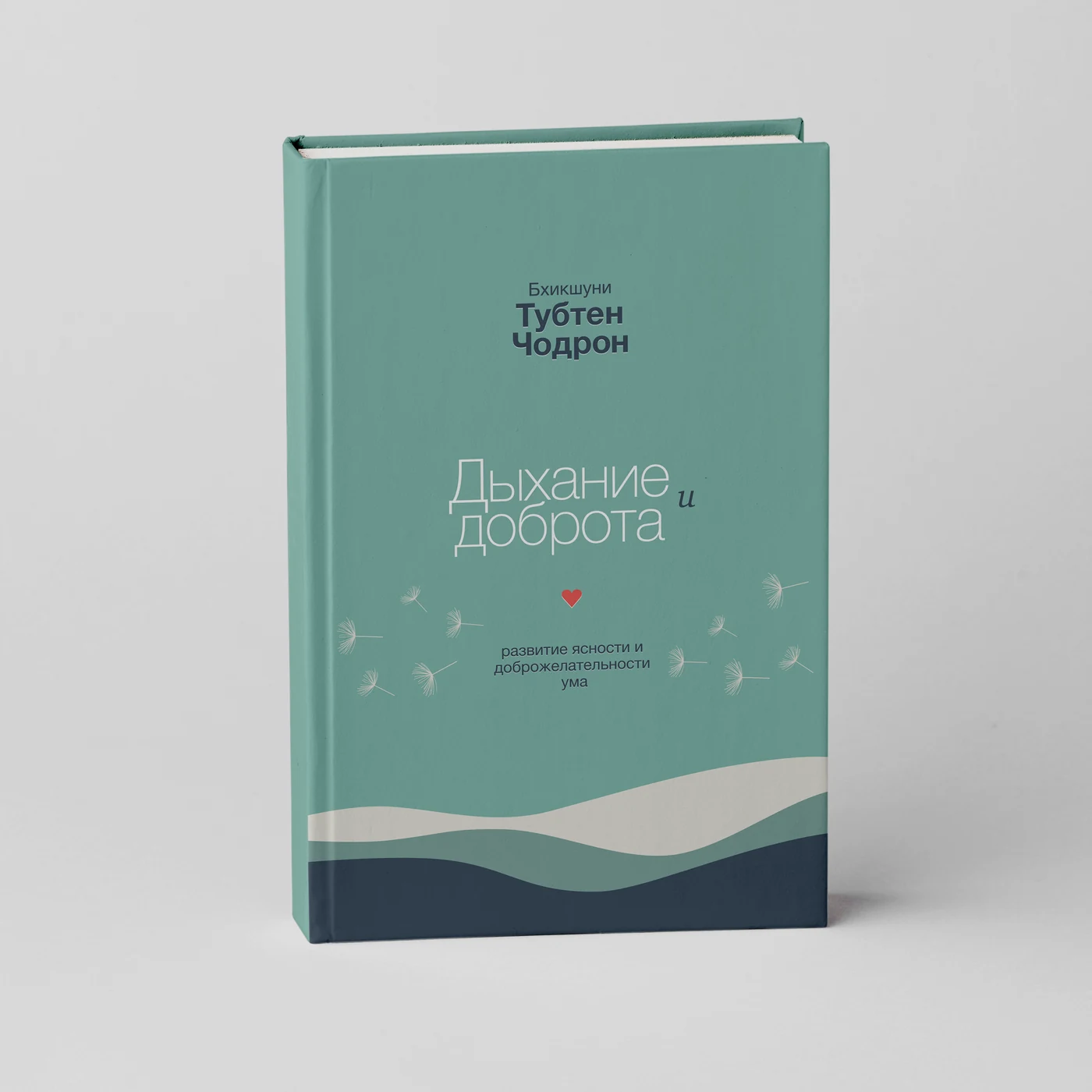
Translated philosophy — B. Alan Wallace, Bhikshuni Thubten Chodron — several volumes over several years. Every cover carries one ornament drawn from the tradition, set on flat colour, with the title in the same face at the same weight throughout. What changes is the drawing and the palette; what never changes is the construction.
This is the one place the ornament is allowed back in, and it is allowed in precisely because everything around it has been stripped. On a shelf beside other Buddhist publishing, the restraint is what makes them findable.
In English
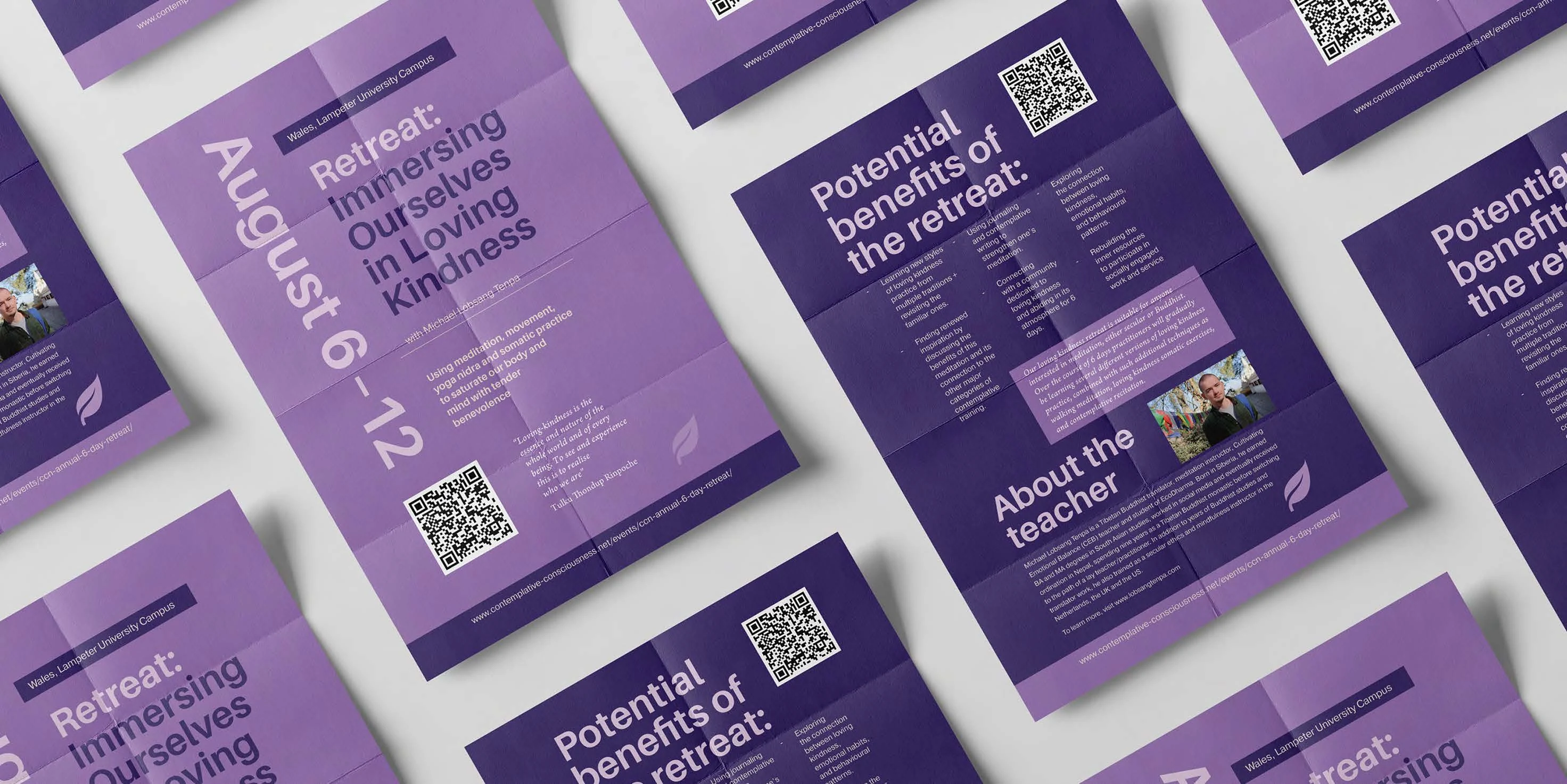
The retreats run in English, and the materials there have the opposite problem: no shelf life, no reverence, read once on a phone or pinned to a noticeboard among forty other notices. So the leaflet at the top of this page drops the book language entirely — flat violet, type set large enough to read across a room, one QR code on every face.
It folds down to a pocket and opens to a full sheet, which is the only reason it can carry both a poster-sized headline and eight paragraphs about what the week involves. The date is set bigger than the title: by the time anyone picks one up, they already know what a retreat is.
More work