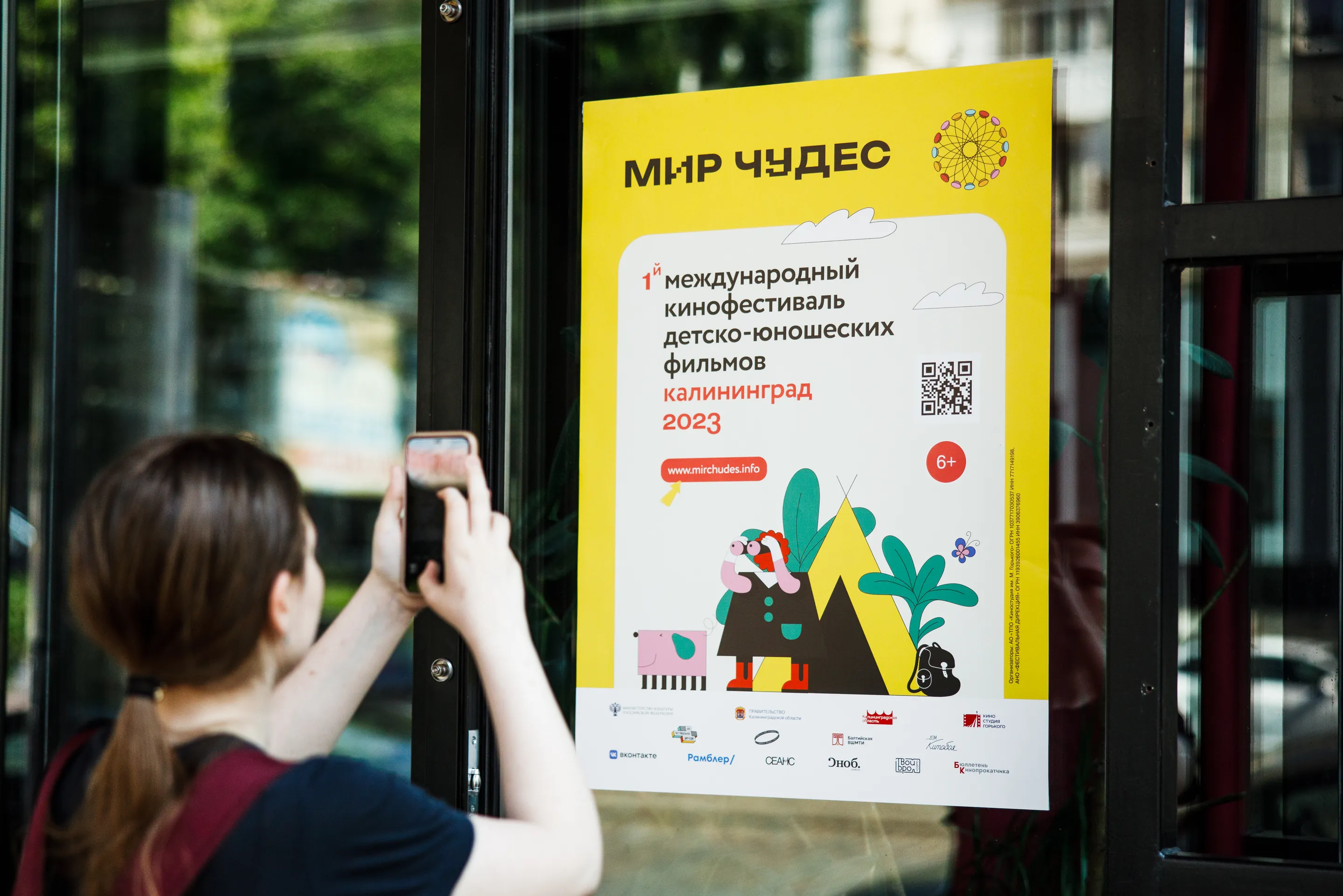
A film festival for teenagers, designed to survive the one test that matters: would they photograph it?
The brief
The first international children's and youth film festival in Kaliningrad — a first edition, with nothing behind it and no audience that had ever been to one.
The core audience is 12 to 17: an age group that ignores anything visibly made for them by adults. The festival ran across four towns of the Kaliningrad region — Kaliningrad, Zelenogradsk, Svetlogorsk and Pionersky — so whatever went up on the street had to hold its own in four different places at once, against every other poster competing for the same glance. And it had to be worth pointing a phone at. Everything else — the badge, the ticket, the tote — followed from that.
The idea
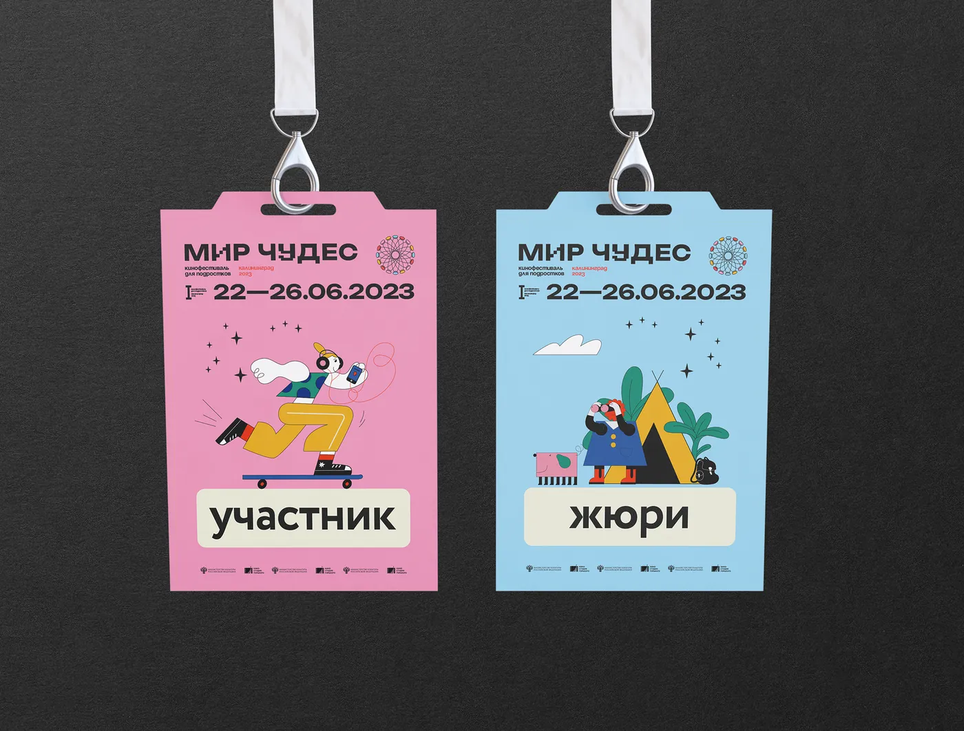
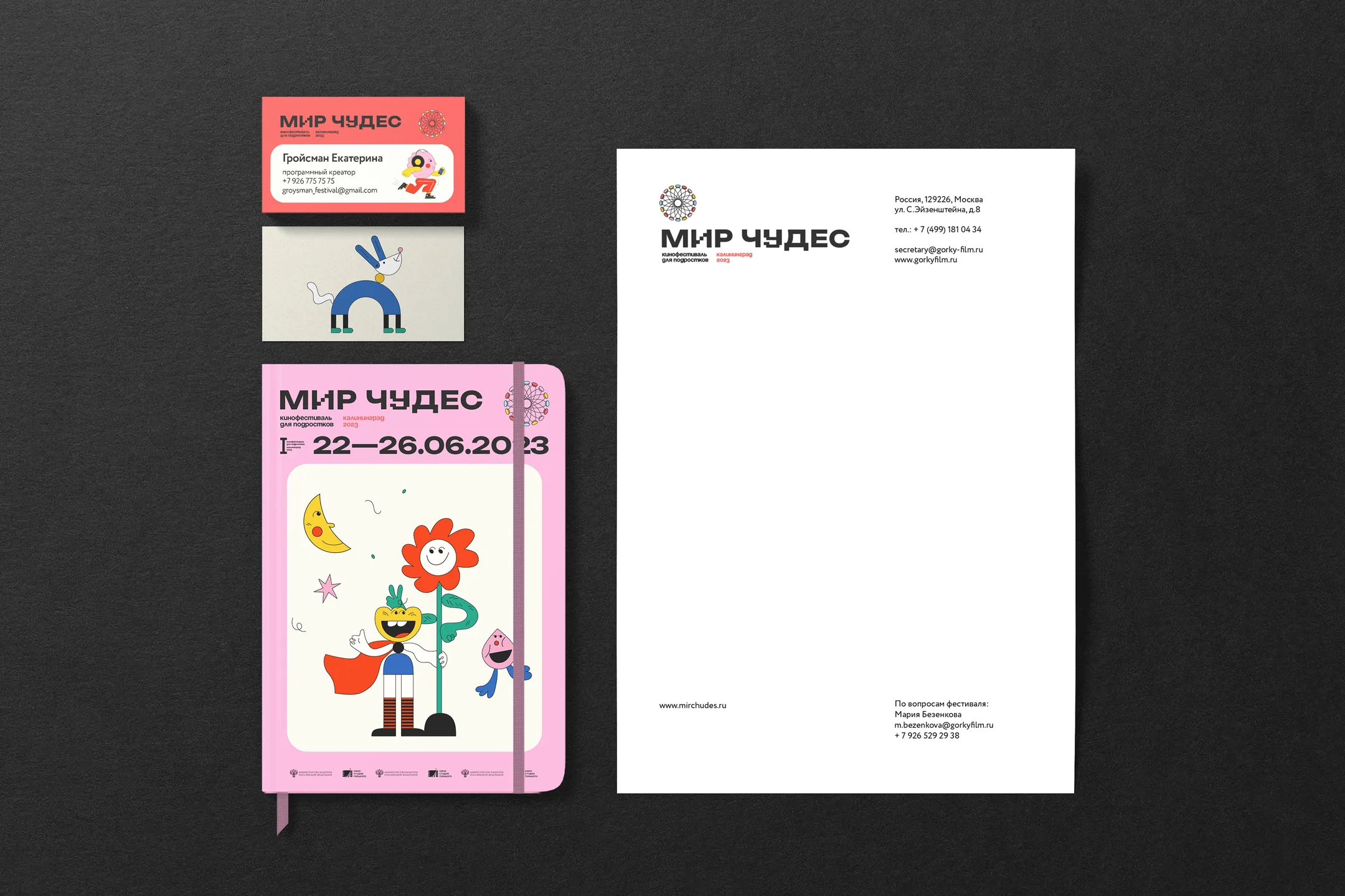
Every surface is a saturated field with a lighter panel floated on top of it — the shape of a photo, a screen, a sticker. The contents change constantly; the silhouette stays recognisable from across the street.
It is a deliberately cheap idea, in the best sense: it survives bad printing, bad weather and a phone camera held at an angle, and it can be rebuilt by anyone on the festival team without breaking.
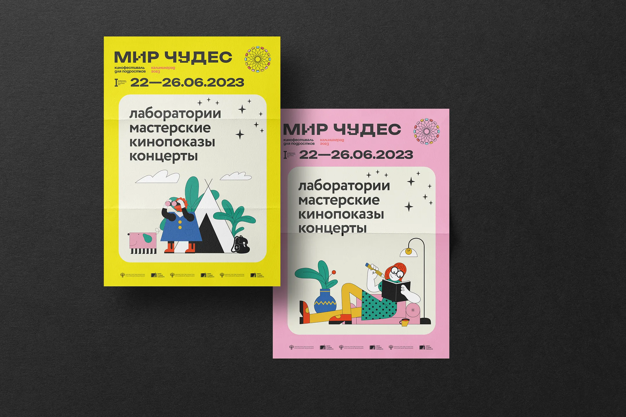
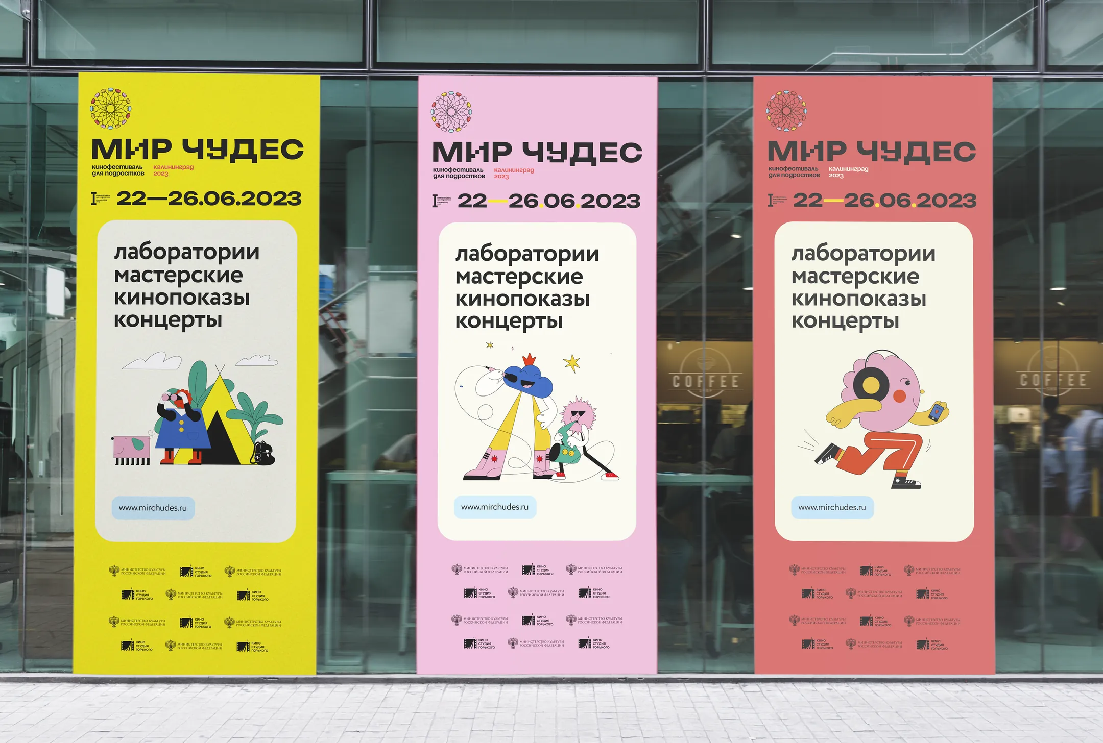
The audience was 12 to 17. The brief was really: don't look like it was made by adults.
Palette
Lemon and pink carry the loud surfaces, sky blue separates the accreditation tiers, and a warm off-white stands in for paper on every panel. Black does the rest. Five values, sampled here from the printed artwork.
The system
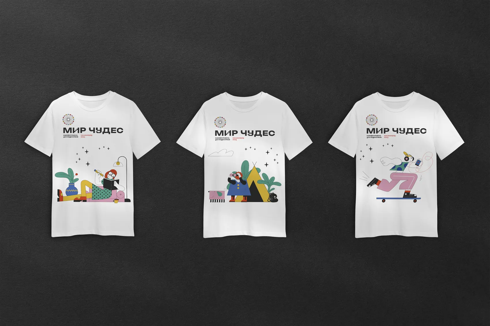
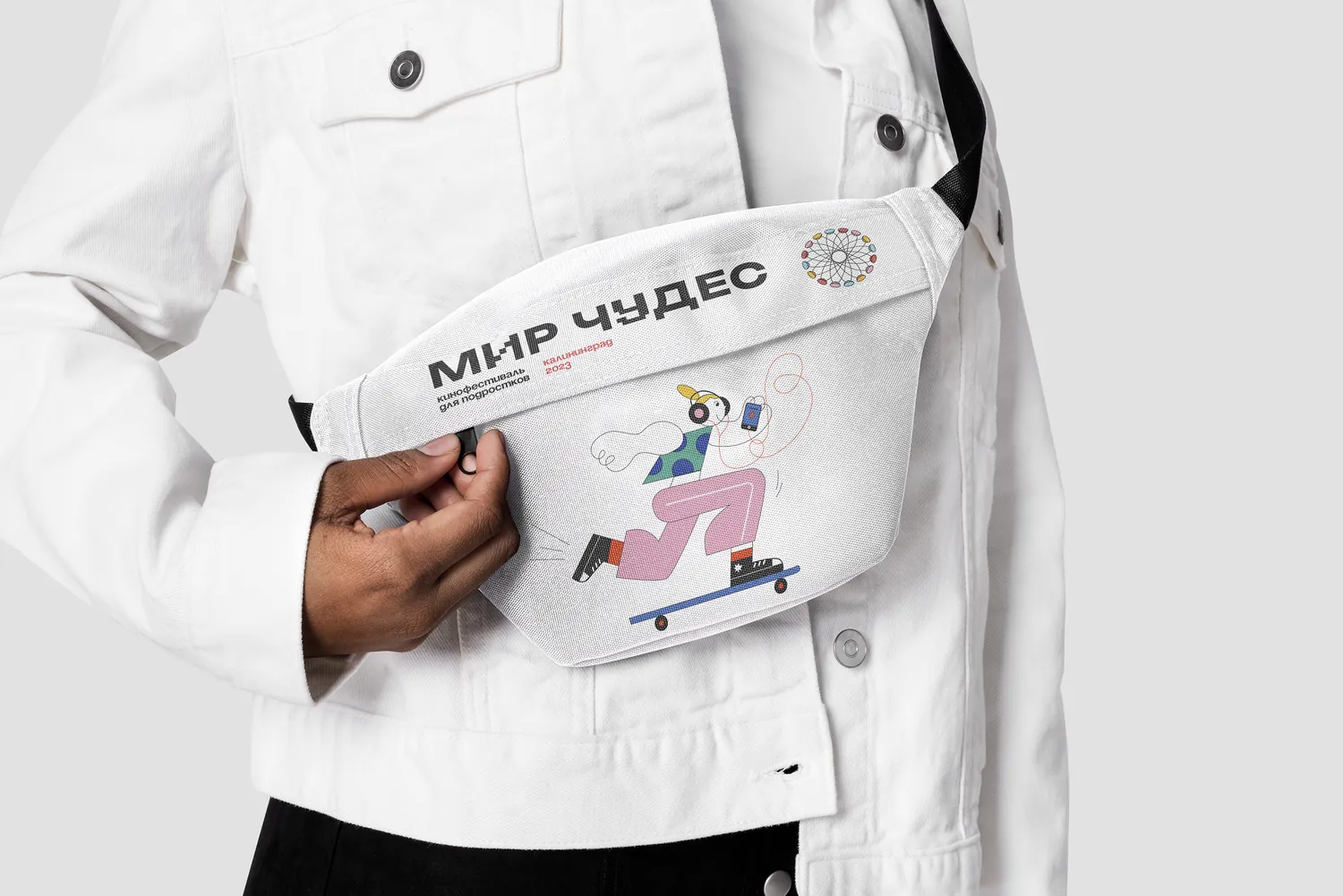
A kaleidoscope rosette works as the mark. A cast of flat characters carries the mood without illustrating any particular film in the programme, which matters for a festival whose line-up is confirmed late.
I commissioned that cast from Lyuba Berezina and briefed it as a population rather than a set of pictures: one flat weight, no outlines, no faces specific enough to belong to a particular film, and enough of them that the festival team could keep recombining figures after I was gone. Directing an illustrator on a first-edition festival is mostly deciding what not to let the drawings do.
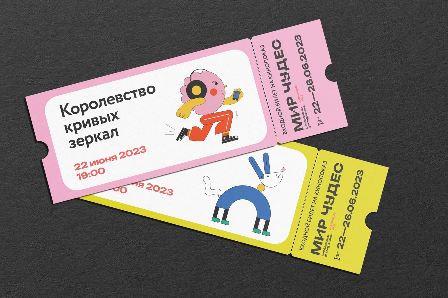
The construction scales without being redrawn: the same relationship of ground, panel and figure holds at every size, so the ticket, the badge and the street banner are visibly the same object at different magnifications.
In the city
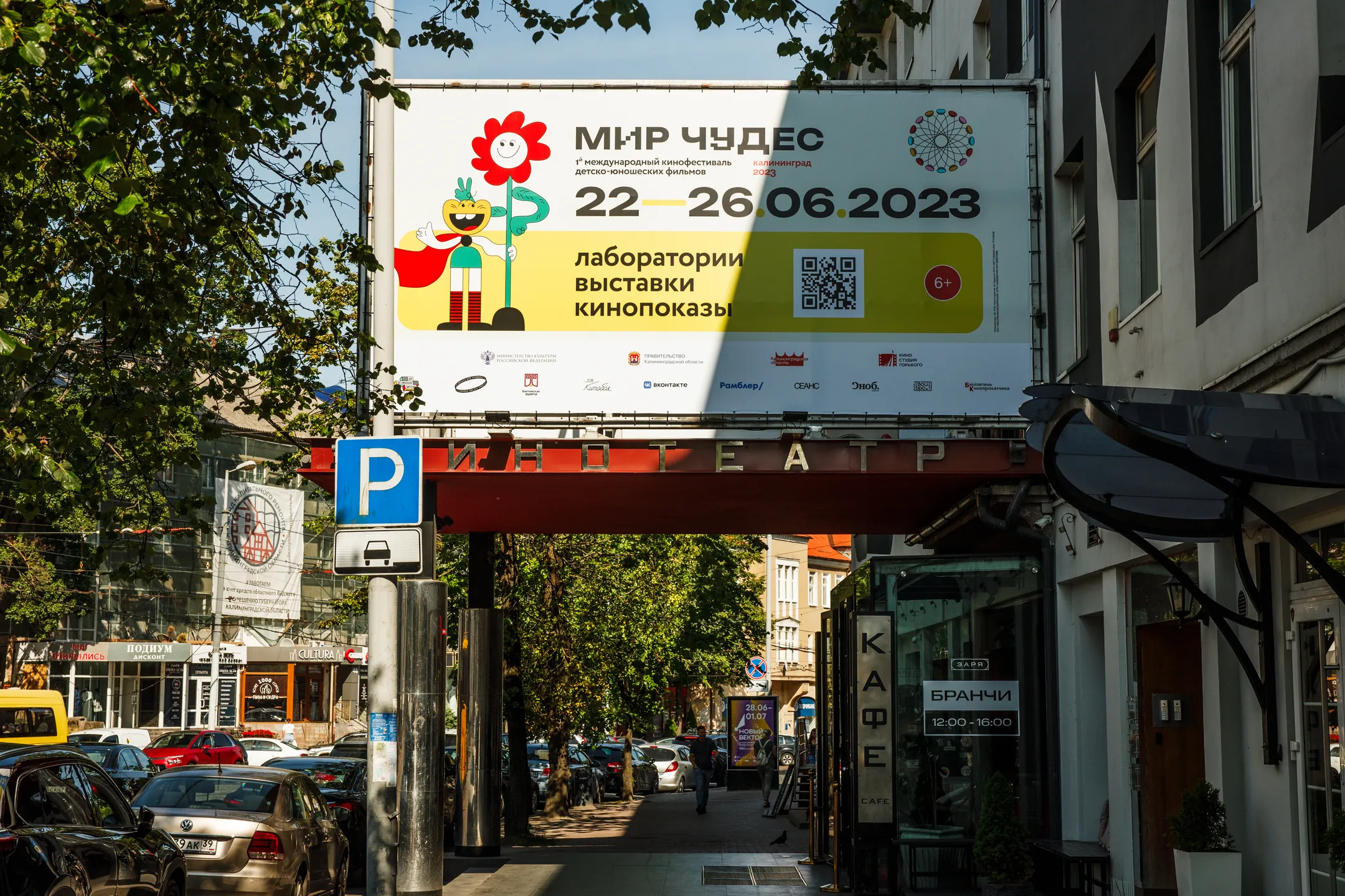
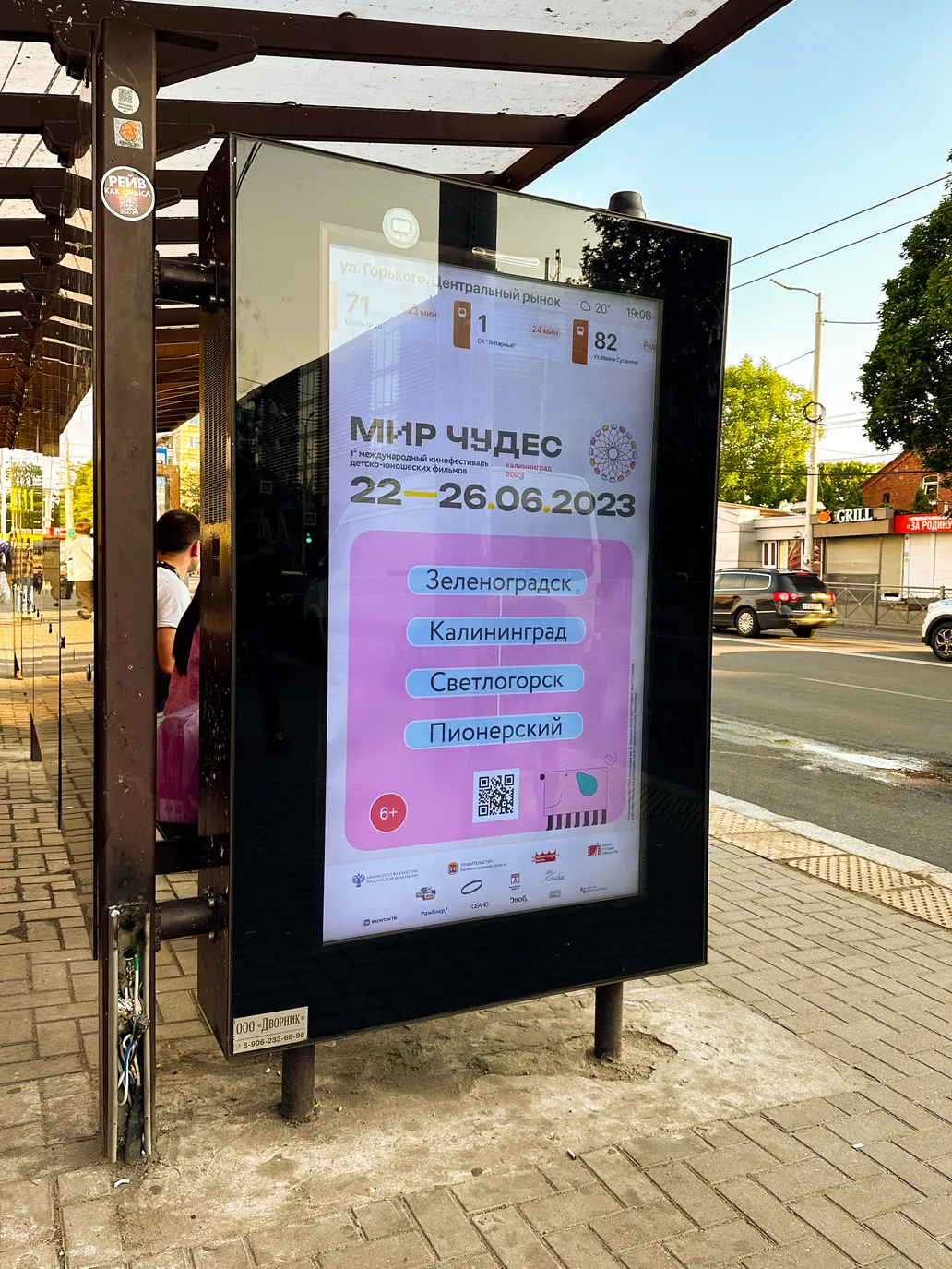
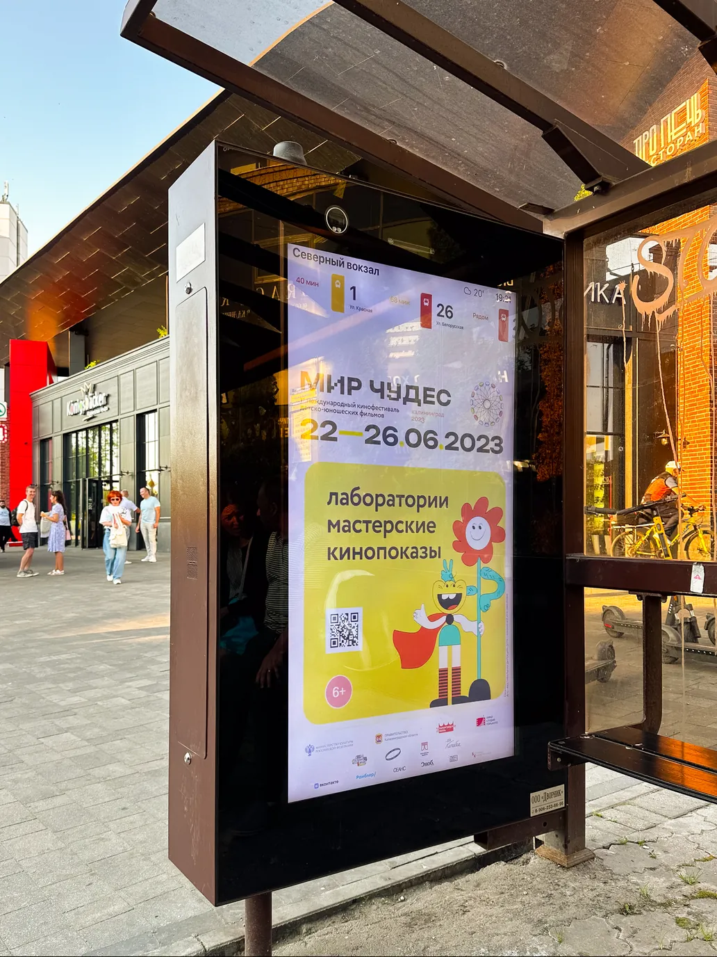
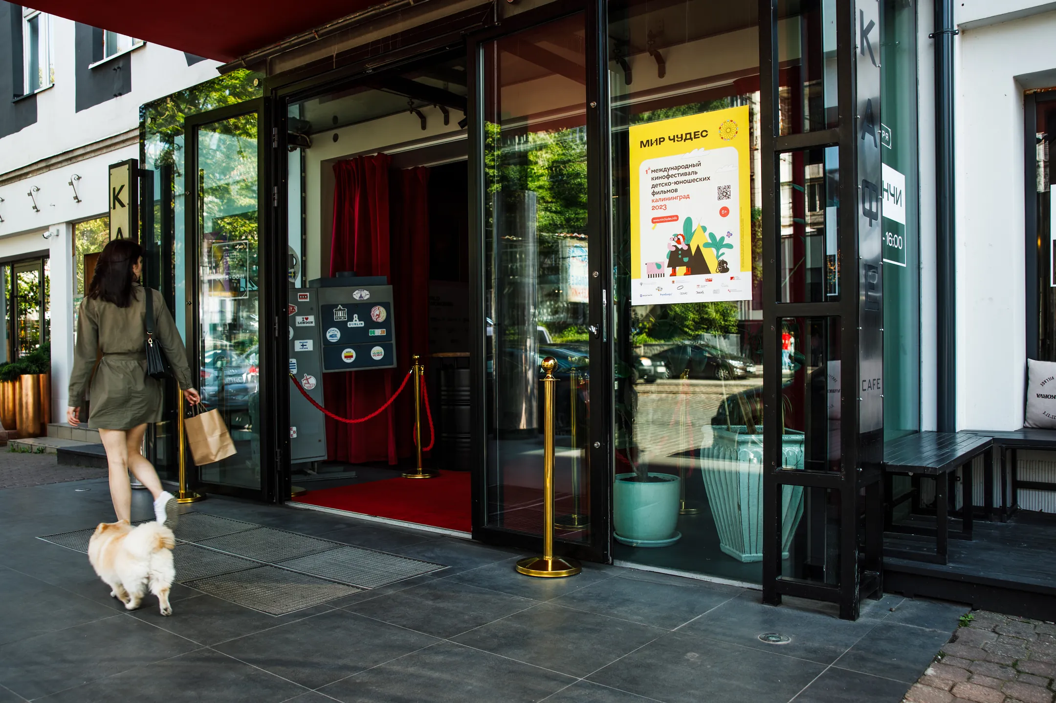
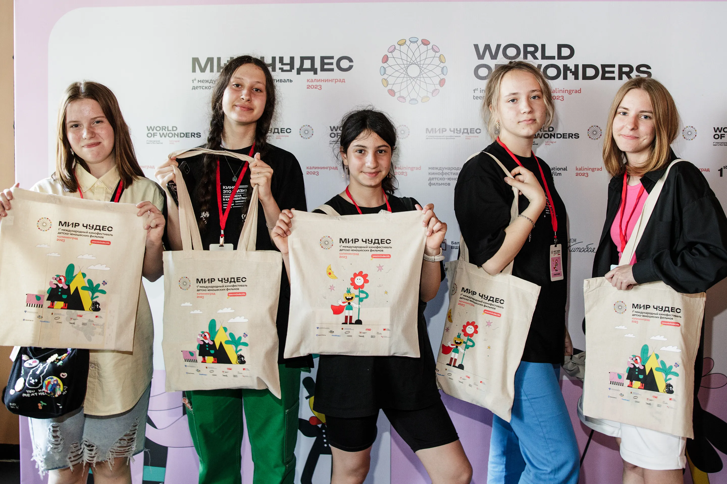
The street is where a festival identity stops being a proposal. Four towns got banners strung over the road, citylights at the bus shelters, posters in shop windows, and a press wall the audience used as a backdrop all week.
More work