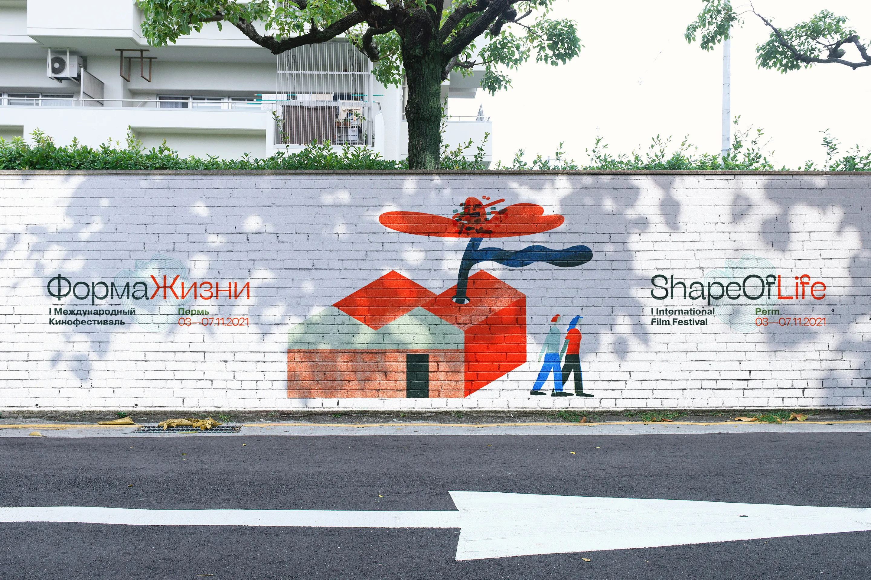
A painted street mural of a red house with a tree growing out of it and two small figures walking, with the festival wordmark in Russian and English on either side.
← Ekaterina Lopushenko Film festival identity

Shape of Life

Three editions of a documentary festival about the forms life takes — and an identity that changed shape along with it.

Client
Gorky Film Studio
Editions
2021 — 2023
Place
Perm, Russia
Role
Identity, art direction, print, web and screens

The brief

An international documentary film festival about the environment and the forms life takes on this planet, held in Perm for three years running.

The first edition had no name recognition and no festival-going habit to lean on. The identity had to work as street advertising months before anyone knew what it was advertising, and it had to hold a five-day programme across several venues without needing a second visual language for the small stuff — the badge, the ticket, the flyer left on a table.

By the third year the festival had an audience, a reputation and a different kind of problem: how to look like it had grown up without looking like a different festival.

The idea

One word, one body

The wordmark sets the two halves of the name as a single continuous form with one red letter at its centre — a living thing is one object made of parts. It rotates to vertical without losing legibility, which is what lets a single lockup serve an A1 poster, a bag seam, a lanyard and a painted wall.

It is also the one element that survived all three editions untouched. Everything else was allowed to move.

Art direction

I commissioned a kit, not a picture

Across four editions I chose the illustrator, wrote the brief, and directed the work to delivery. What I asked for was never a finished image, because a finished image can only be used once.

2021, Bella Leyn. Printmaking textures, but drawn as separable objects at one line weight — stones, birds, houses — so that a poster, a tote and a painted wall could each be composed from the same set without anything being redrawn. The brief was a parts list, not a scene.

2022, Bella Leyn. Same hand, new structure. The sheet now split into two flat fields, so every drawing had to survive being cut in half and read from both sides of the seam — a turbine rooted in the white and blading into the dark. That constraint went into the brief before the first sketch.

2023, Lyuba Berezina. A different hand on purpose: painted, one figure growing into a landscape, because by the third year the festival could afford to stop assembling and start depicting. The brief changed from parts to a single picture with a path left open for the ribbon to travel through.

Choosing whose hand fits which year, writing the constraint into the brief, sending work back, and knowing when to stop — that is the part of the job that leaves no artefact on this page.

First edition · Perm · 2021

Printed matter

The first year runs on a printmaking vocabulary: monotype and linocut textures, stacked stones, wading birds, small red houses. Nothing in the kit is a fixed illustration — it is a set of pieces recomposed for every carrier, so a poster, a tote and a wall share a language without ever repeating a picture.

Illustration, first edition: Bella Leyn.
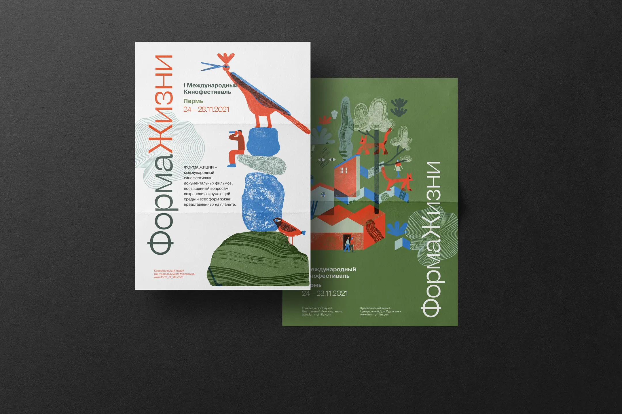
A festival poster and a folded programme on a dark ground, both carrying the wordmark set vertically along the edge.
Two sheets, first edition. Turned through ninety degrees the word still reads as one body, and the red letter still sits at its centre.
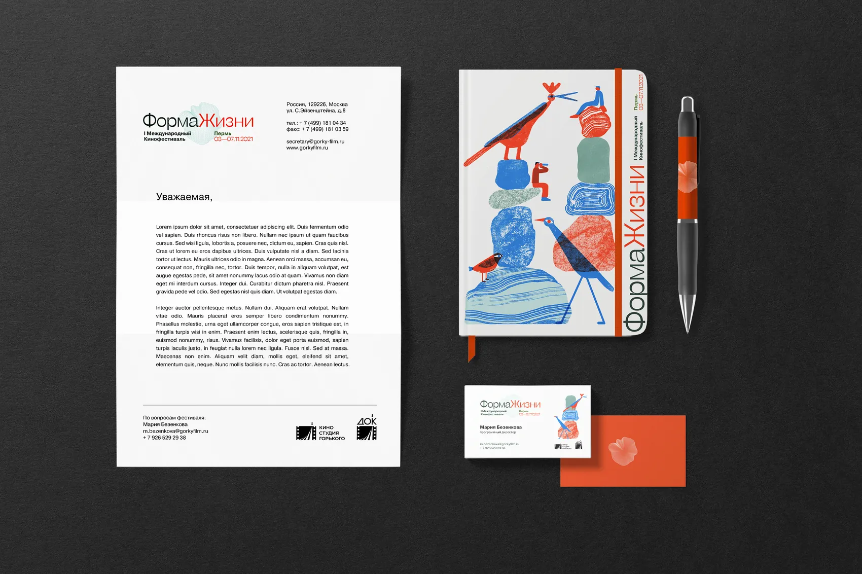
Festival stationery: letterhead, business cards, a notebook and a branded pen, all carrying printmaking-style illustration.
Stationery and internal documents.
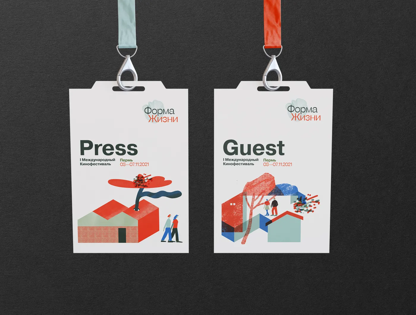
Two accreditation badges on lanyards, marked Press and Guest, each with a different illustrated scene.
Accreditation — Press and Guest, each with its own scene from the kit.
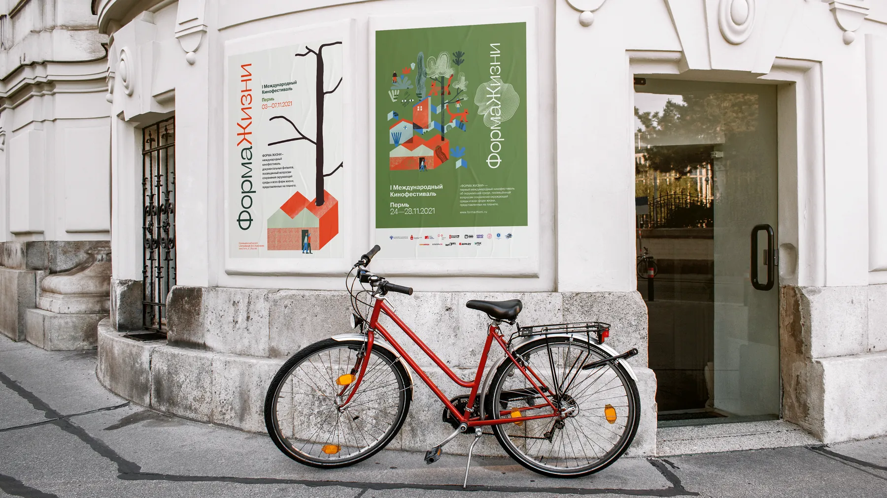
Two festival posters mounted on the facade of a white classical building, with a red bicycle parked below.
Posters in the city. Two grounds, one construction.
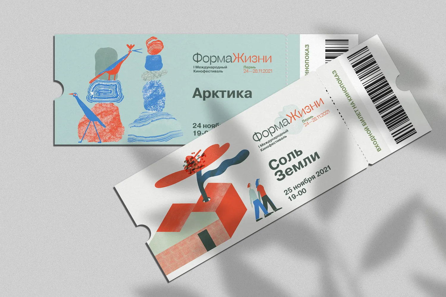
Two festival tickets for the screenings Arctic and Salt of the Earth, each with a different printmaking scene, a barcode and a perforated stub.
Screening tickets. One scene from the kit per film, so a stub kept in a coat pocket still says which evening it was.
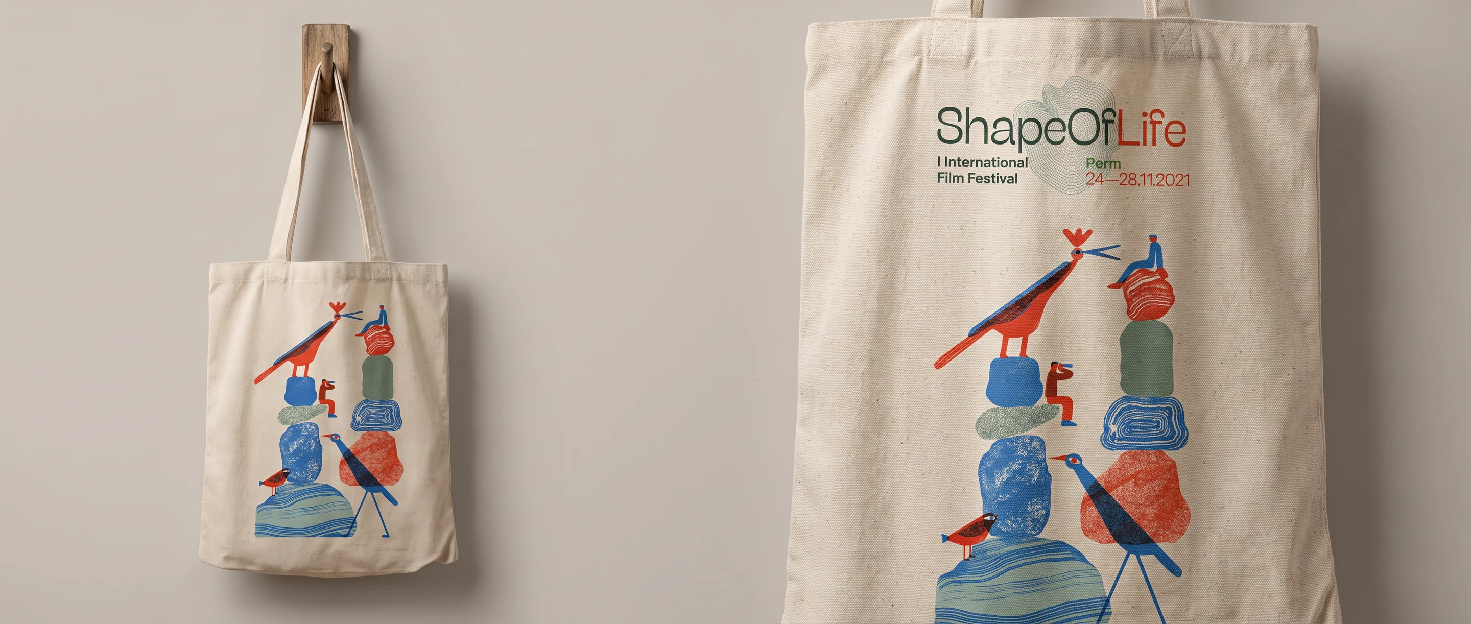
A canvas tote bag on a wooden peg, printed with stacked stones and birds under the English ShapeOfLife lockup and the festival dates.
Tote, first edition. The English lockup carries a contour-line cloud in place of the Cyrillic wordmark's red letter — the same idea, made to work in a script that does not have one.

Palette · 2021

Brick, cobalt, forest

A documentary festival about ecology is expected to arrive in greens and browns. This one runs on a vermilion that behaves like printing ink, a cobalt borrowed from the birds, and a forest green kept dark enough to hold white type.

A festival poster is easy. The programme is the hard object.

The programme

Five days on one sheet of paper

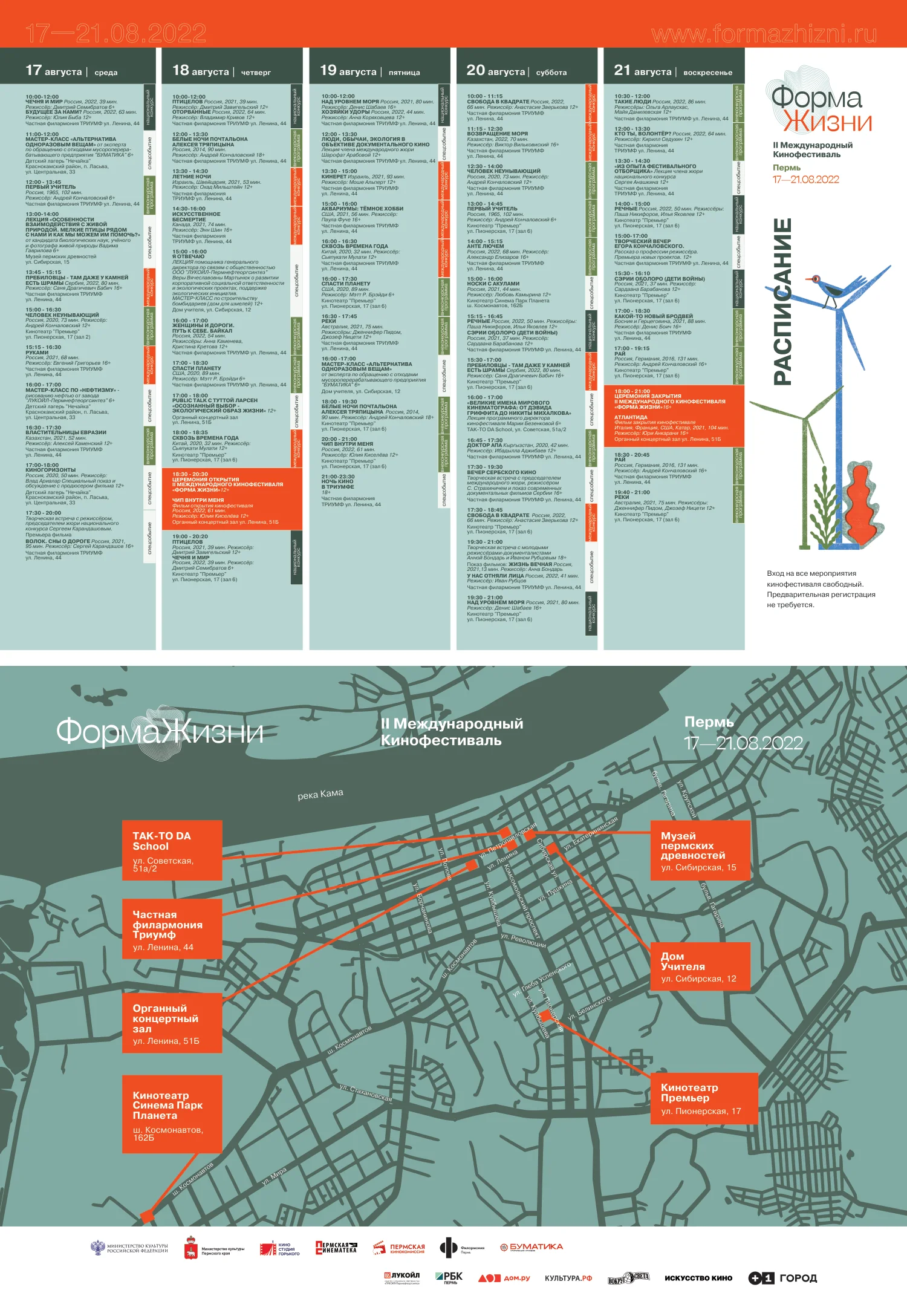
Every festival has the same impossible print job: the whole schedule, legible, on something that folds into a coat pocket. Colour does the sorting before any reading starts — each day takes a ground, each event type a block.
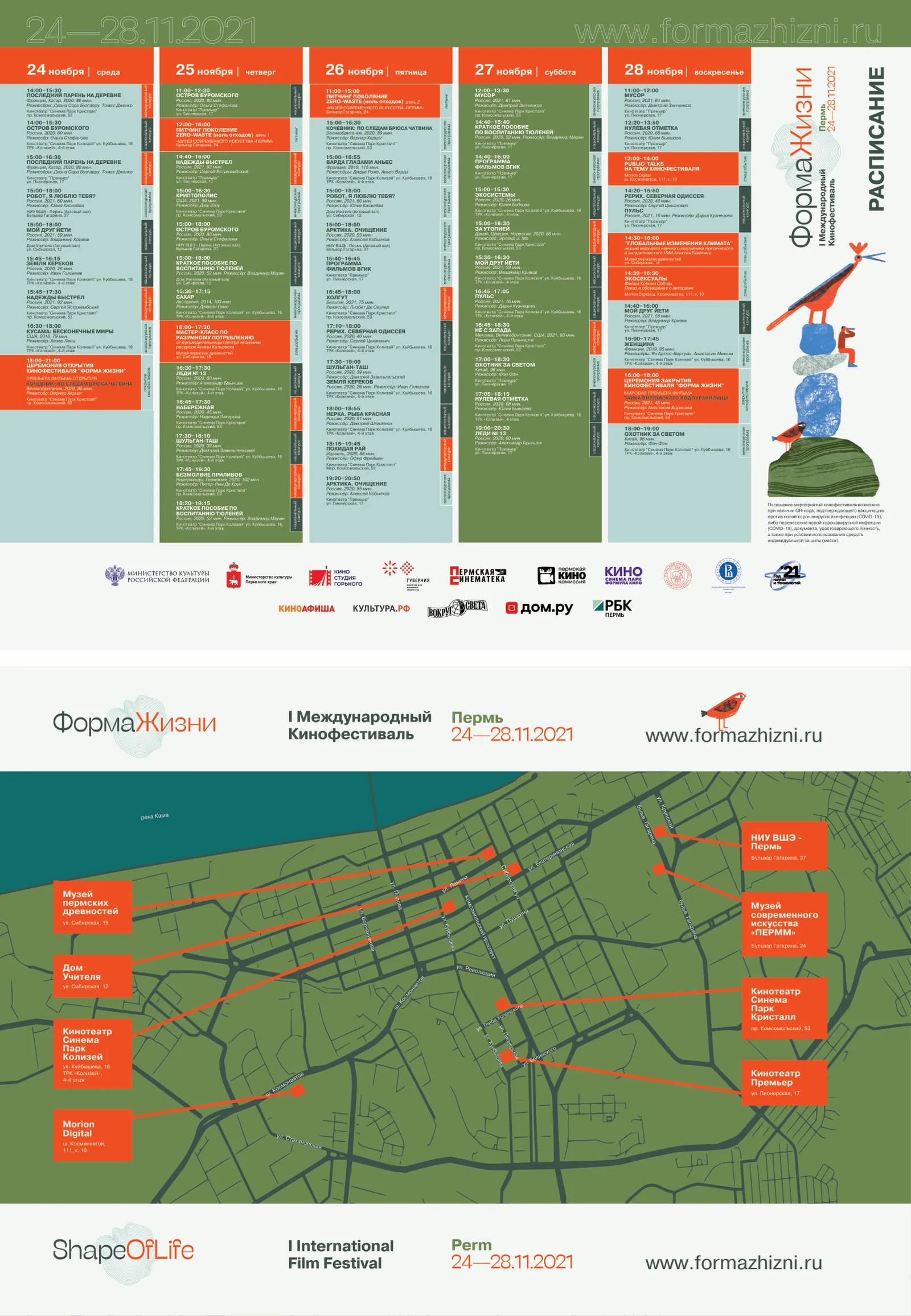
Both sides of the folded A3 programme: the five-day schedule set in vermilion, sage and forest-green blocks, and a green map of Perm with six venues marked in red and tied to their addresses by thin lines.
Both sides of the sheet, first edition. Five days of screenings on one, the city on the other — the festival ran across six venues, so one object has to answer when and where in a single unfolding.

Screens

The other half of the job

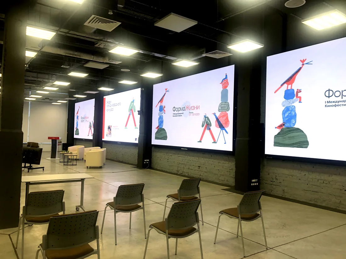
A festival is not only printed. The venue runs on LED walls and the screenings open on a cinema screen ten metres wide, and both were drawn from the same kit rather than bought as a template.
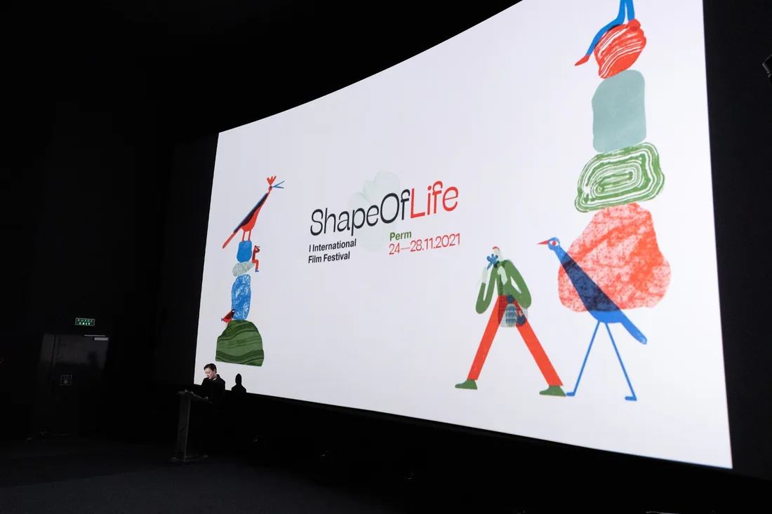
A cinema screen filling a dark auditorium with the English ShapeOfLife lockup and the stacked-stone illustration on either side, a presenter at a lectern below.
The English lockup at cinema scale. Where the Cyrillic mark has a red letter at its centre, this one carries a contour-line cloud — the same idea in a script that has no such letter.
Four LED walls along a brick-walled foyer, each carrying a different frame of the same identity: the mark alone, a jury slide, the full lockup, and a magnified crop.
Four walls in the foyer, run as one composition — the mark, a jury slide, the full lockup, a magnified crop — rather than four copies of the same slide.
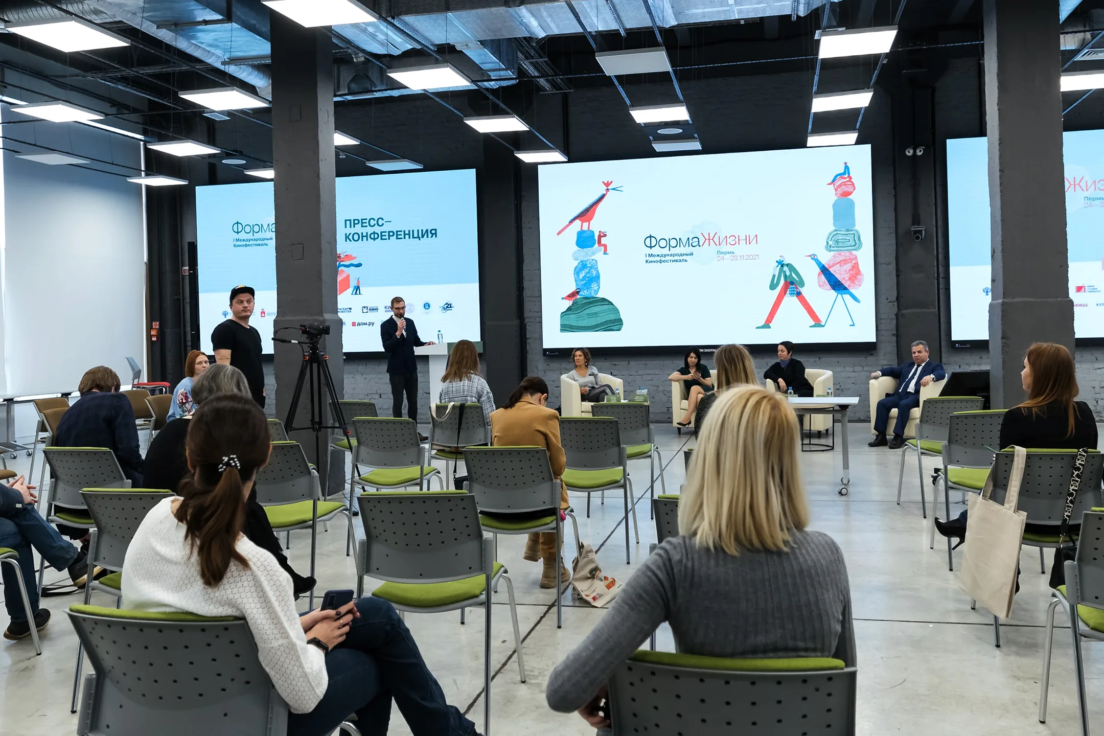
The opening press conference of the first edition: a spaced-out audience on green chairs facing a panel, with the identity running across three LED walls behind them.
Opening press conference, November 2021. Three walls at once, in a room lit for television rather than for print, with the audience seated at pandemic spacing.
Second edition · Perm · 2022

The field splits

The second year keeps the printed texture and puts it on a new structure. The sheet divides into two flat fields and the illustration crosses the seam between them — a turbine rooted in the white half with its blades in the dark one, a walking figure stepping out of the picture and into the colour.

A grid of soft circles arrives as the one new device of that year. It fills whatever the illustration leaves empty, so a poster is never half a picture and half a hole.

And the wordmark moves between the fields: in the dark block at the top of one sheet, in the saturated block at the foot of the other. Same lockup, working as a masthead in one and as a signature in the other.

Illustration, second edition: Bella Leyn.
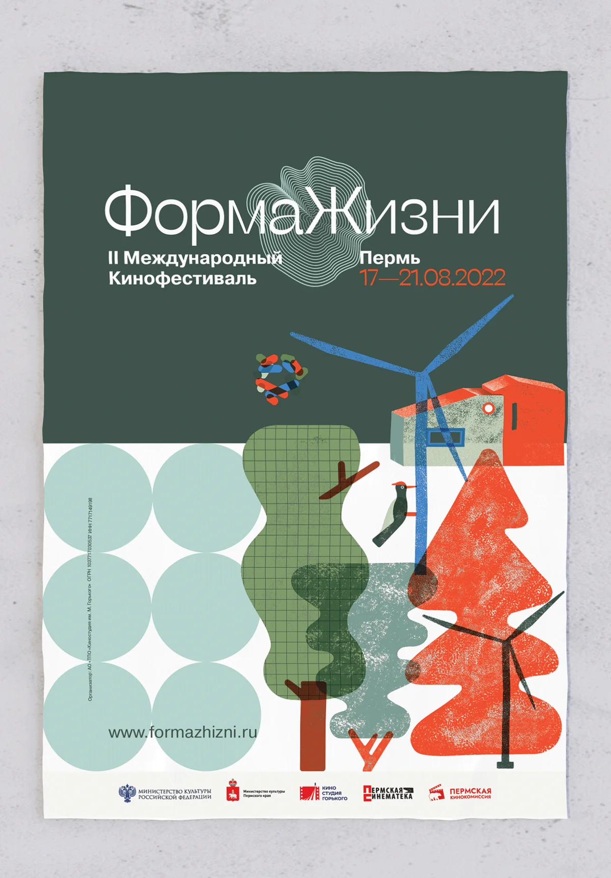
The 2022 poster: a dark forest-green field above with the white wordmark and the dates 17—21.08.2022, a white field below carrying a wind turbine, a red house and textured trees, with a grid of pale green circles at the lower left.
Second edition, 17—21 August 2022. Dark field above, white below, the turbine crossing the seam.
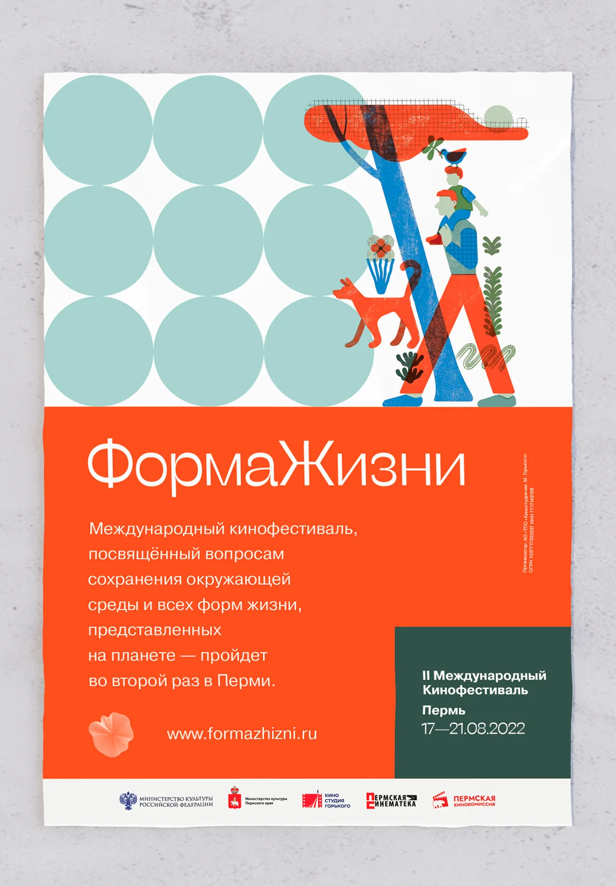
The companion poster with the structure inverted: the circle grid and a walking figure carrying a child on the white field above, the wordmark and a standfirst reversed out of a vermilion block below, with the dates in a dark green panel.
The same structure inverted — picture above, wordmark and standfirst in the block below.
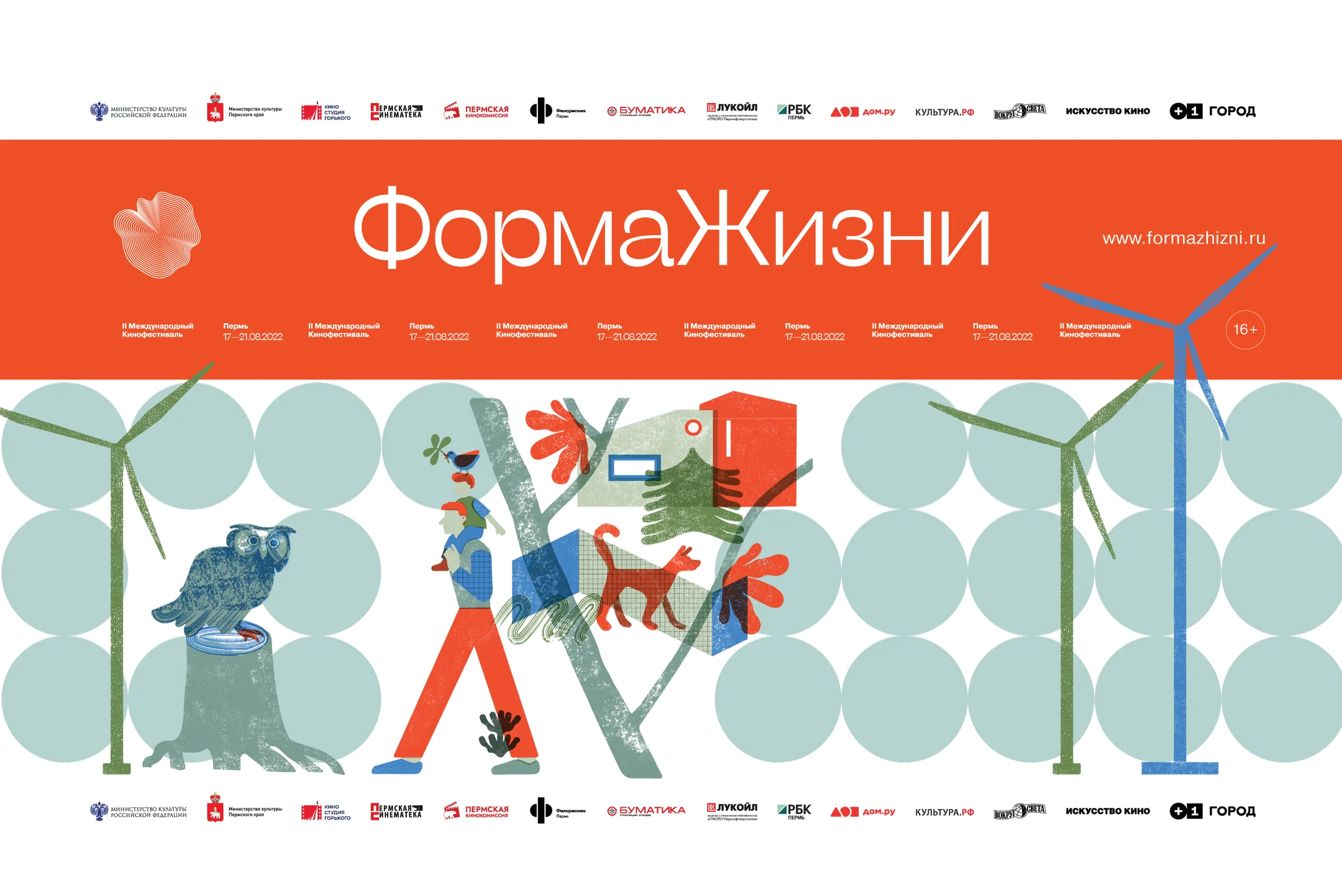
The wide street banner for 2022: a vermilion band carrying the wordmark and the web address, under it the dates repeated eight times across the width, and below a long field of pale circles with an owl on a stump, a walking figure and wind turbines.
Street banner. At six metres the sheet has no margins to spare, so the dates simply repeat across the band — a passer-by reads whichever one is in front of them.
Both sides of the 2022 A4 programme: the five-day schedule with film titles, running times, directors and age ratings, and a map of Perm with the four venues marked.
The programme, both sides. Same job as the first edition, folded down to A4 — five days of screenings on one side, four venues on a map on the other.
Third edition · Perm · 2023

A different hand

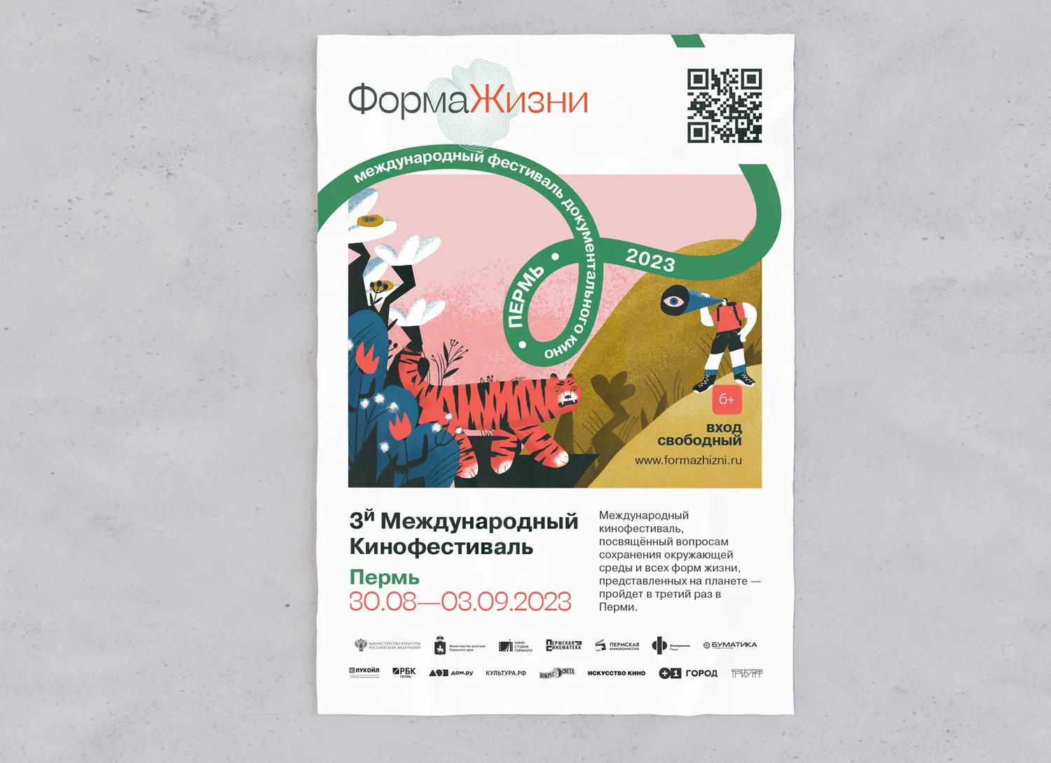
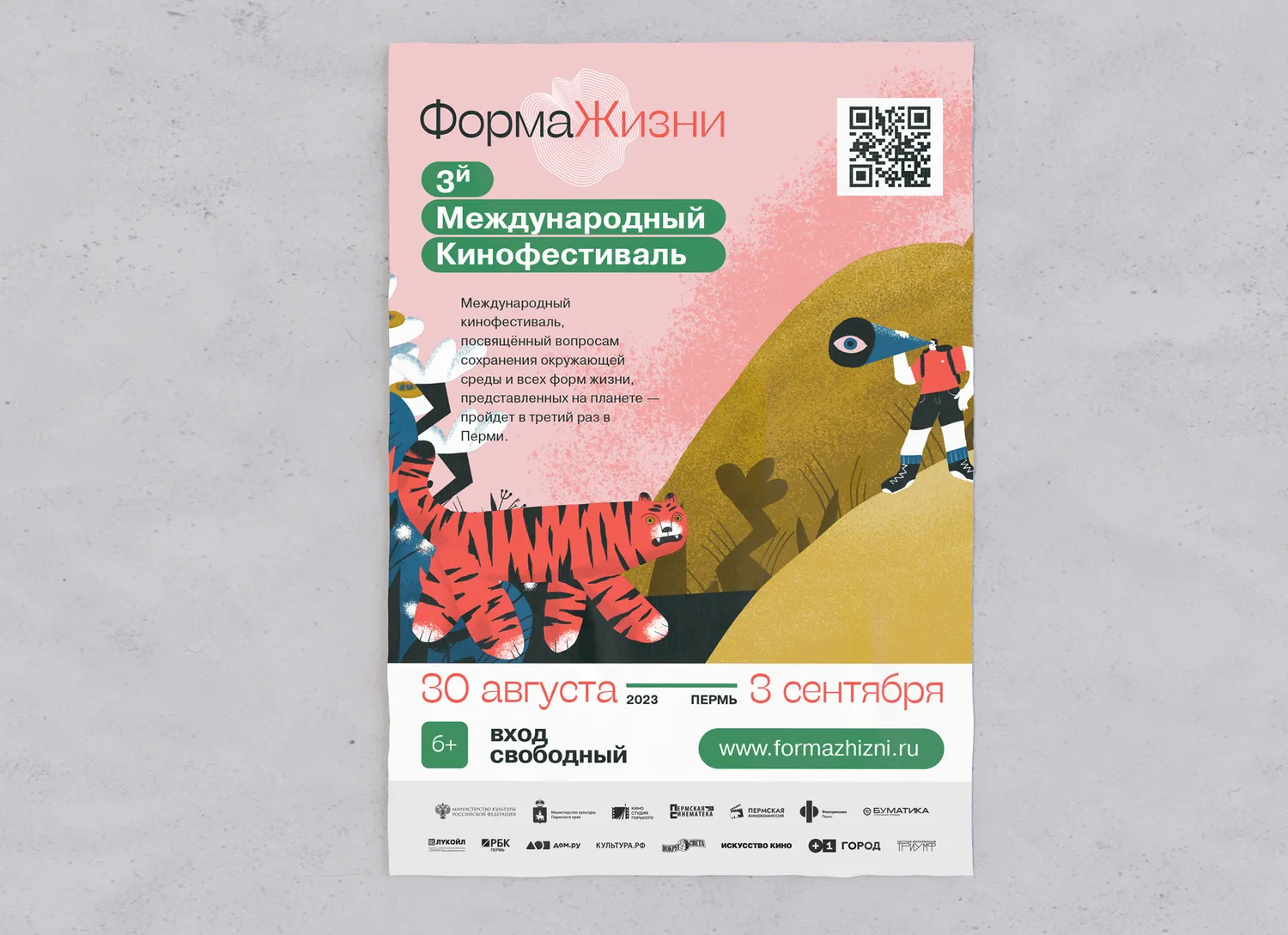
By the third year the festival had an audience and could afford to be less literal. The printed textures gave way to painted illustration — a single figure growing into the landscape, rather than a landscape assembled out of separate parts — and a serpentine ribbon took over the job of carrying dates and venues around the image.

The palette moved with it, into a deep emerald that reads as forest, water and film stock at once. The wordmark did not move at all, which is the only reason the two years read as the same festival.

Illustration, third edition: Lyuba Berezina.
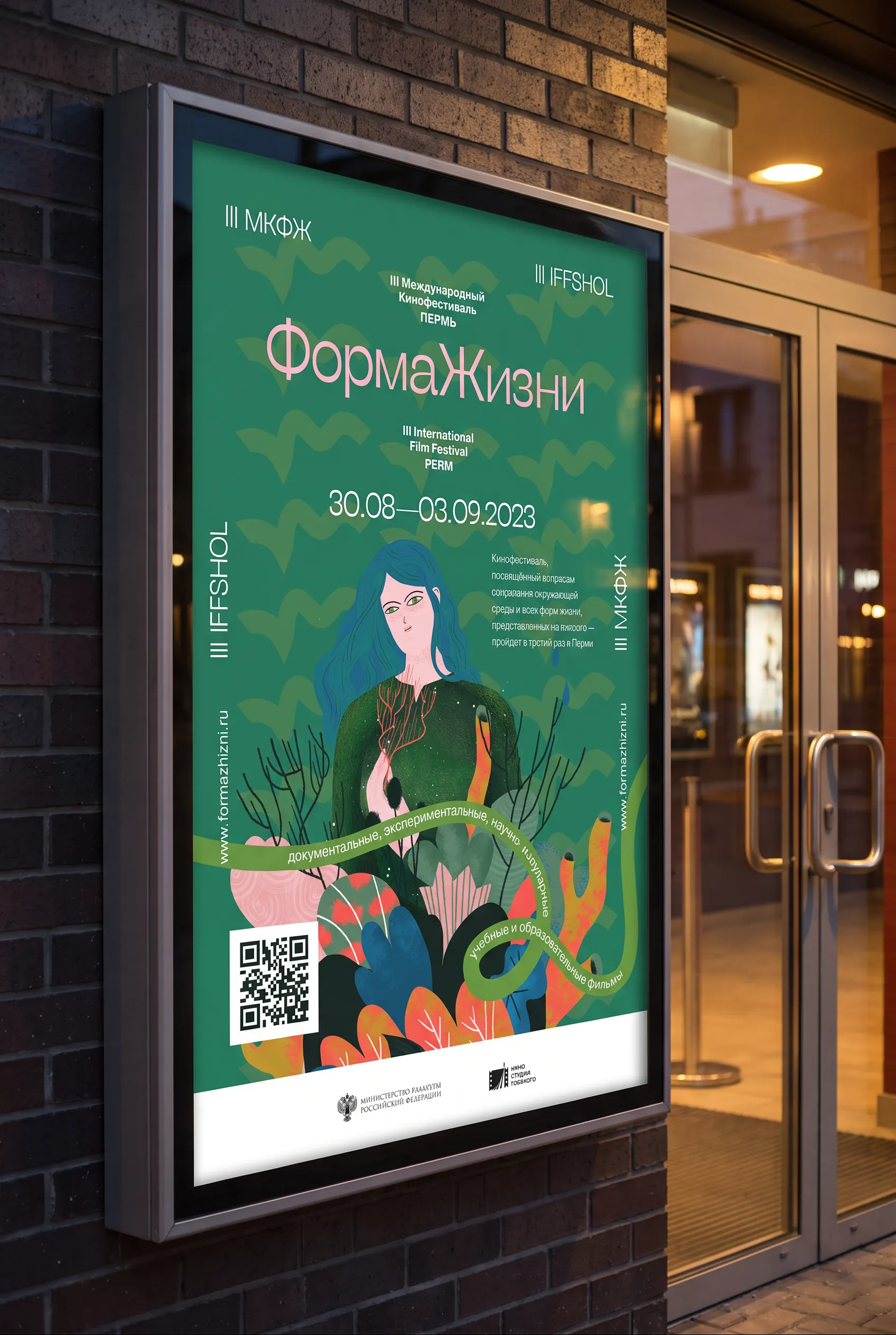
The 2023 key poster in a lit street case on a brick wall at dusk: a woman with blue hair painted into a green landscape, the wordmark above and a ribbon carrying the dates.
Key visual in a street case. The wordmark sits high enough to clear the frame and still read from the far pavement.
A 2023 festival poster on a mustard ground with a painted animal and a green ribbon carrying the dates.
The same construction on a second ground.
A 2023 festival poster on a blush ground with a painted tiger and the ribbon device.
And a third. The ribbon is the constant.
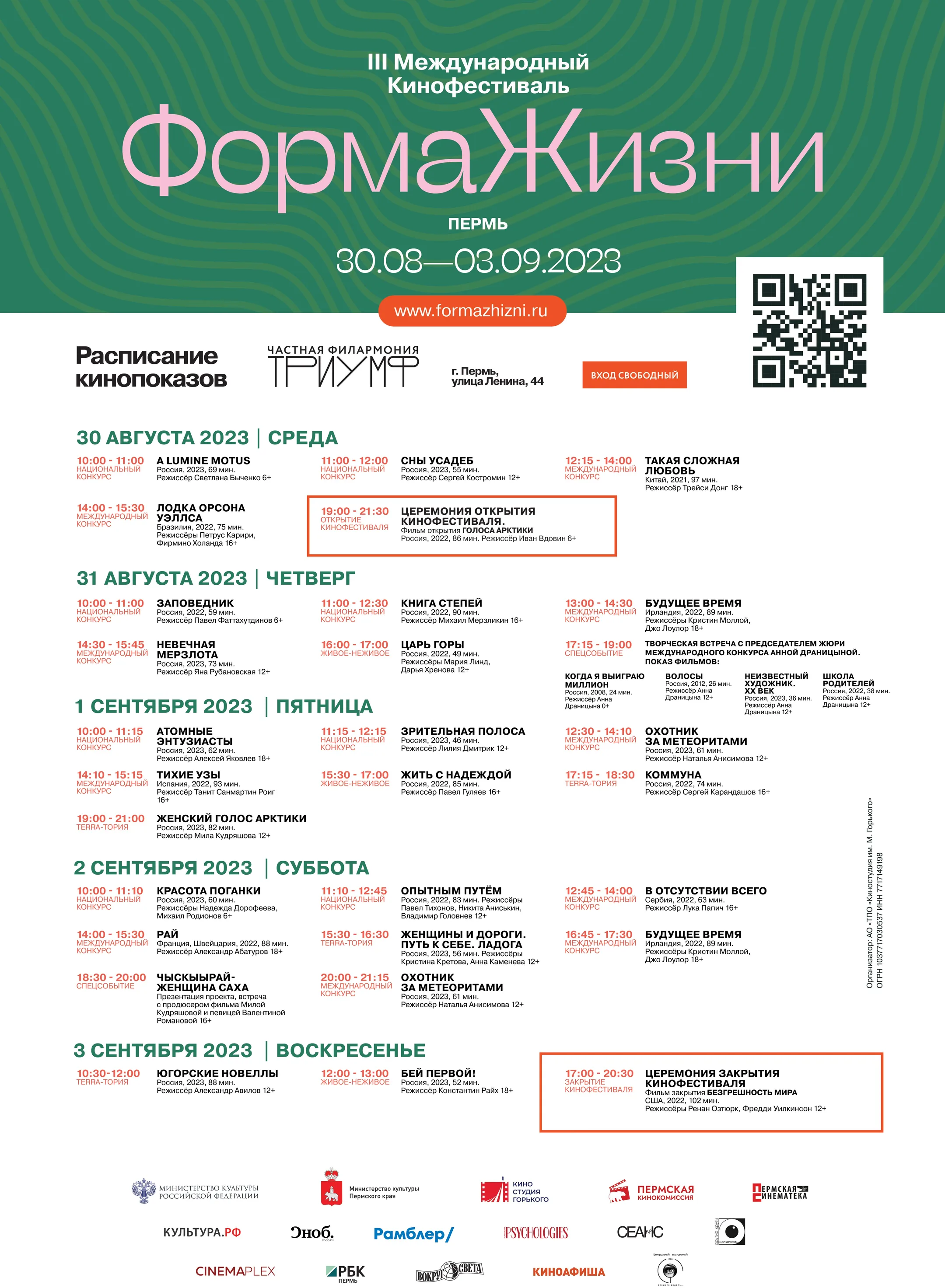
The A1 schedule poster: a green masthead over five days of screenings, each day a dated band, every entry giving time, title, director and venue, with the funders' logos ranged along the foot.
The same print problem, solved for a wall instead of a pocket: five days, thirty-odd screenings, one A1 sheet. Read it at arm's length and the days separate before the times do.
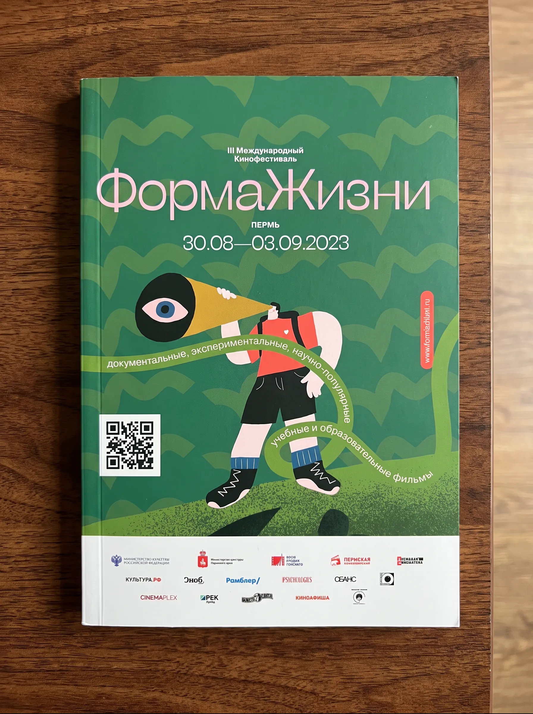
The printed festival catalogue on a wooden table, green cover with the figure and megaphone illustration and a ribbon carrying the programme categories.
Festival catalogue. The ribbon does the same job it does on the poster — it carries the categories around the figure instead of listing them underneath.

Palette · 2023

Emerald, teal, blush

Sampled from the printed key visual. The deep green does the work the vermilion used to do — it is the colour people recognise from across a foyer.

On the ground

Where it actually had to work

The part of a festival identity that cannot be faked in a mockup: a printed wall in a brick room lit for atmosphere rather than for reproduction, a roll-up in a badly lit corridor, a flyer that has to survive being left on a bar table.
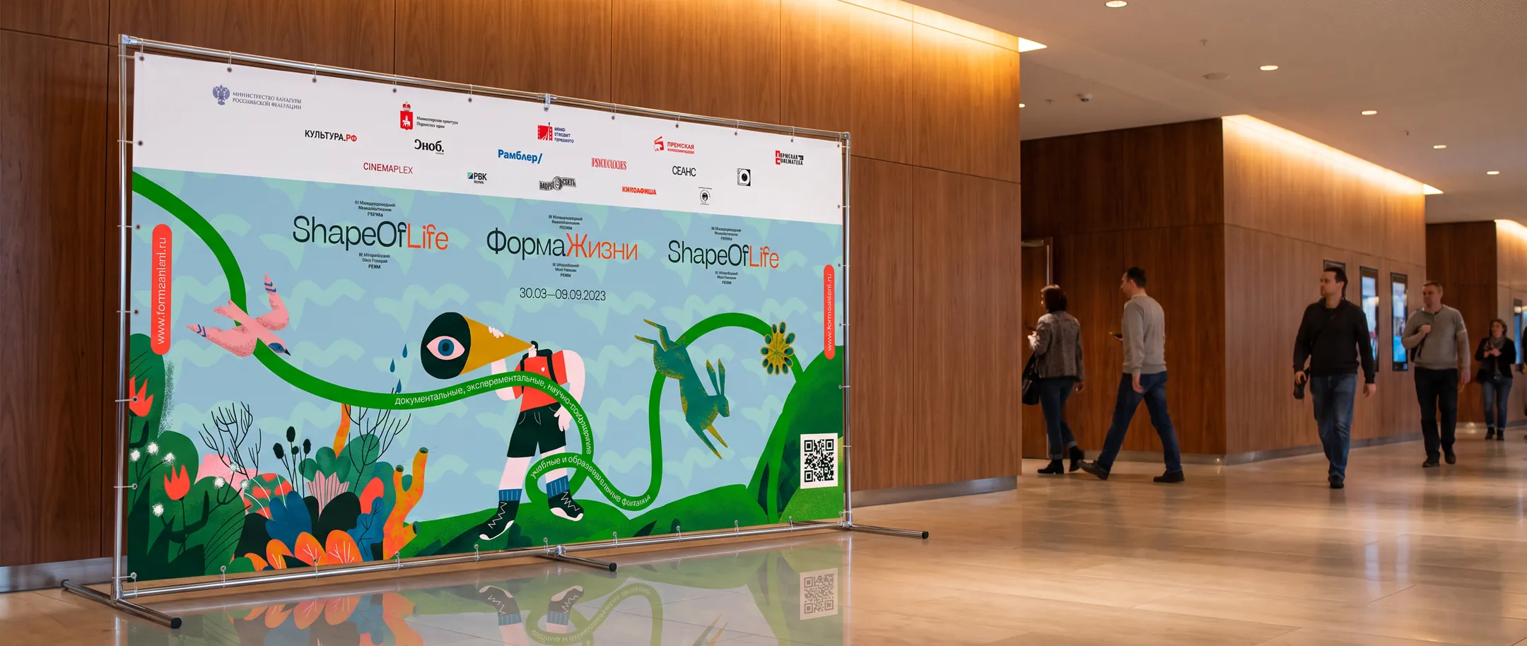
The festival press wall on a banner stand in a wood-panelled foyer, visitors walking past, printed with the illustration and both language lockups.
Press wall in the foyer. Both lockups sit on one field, far enough apart that a photograph taken from either side still carries the festival name.
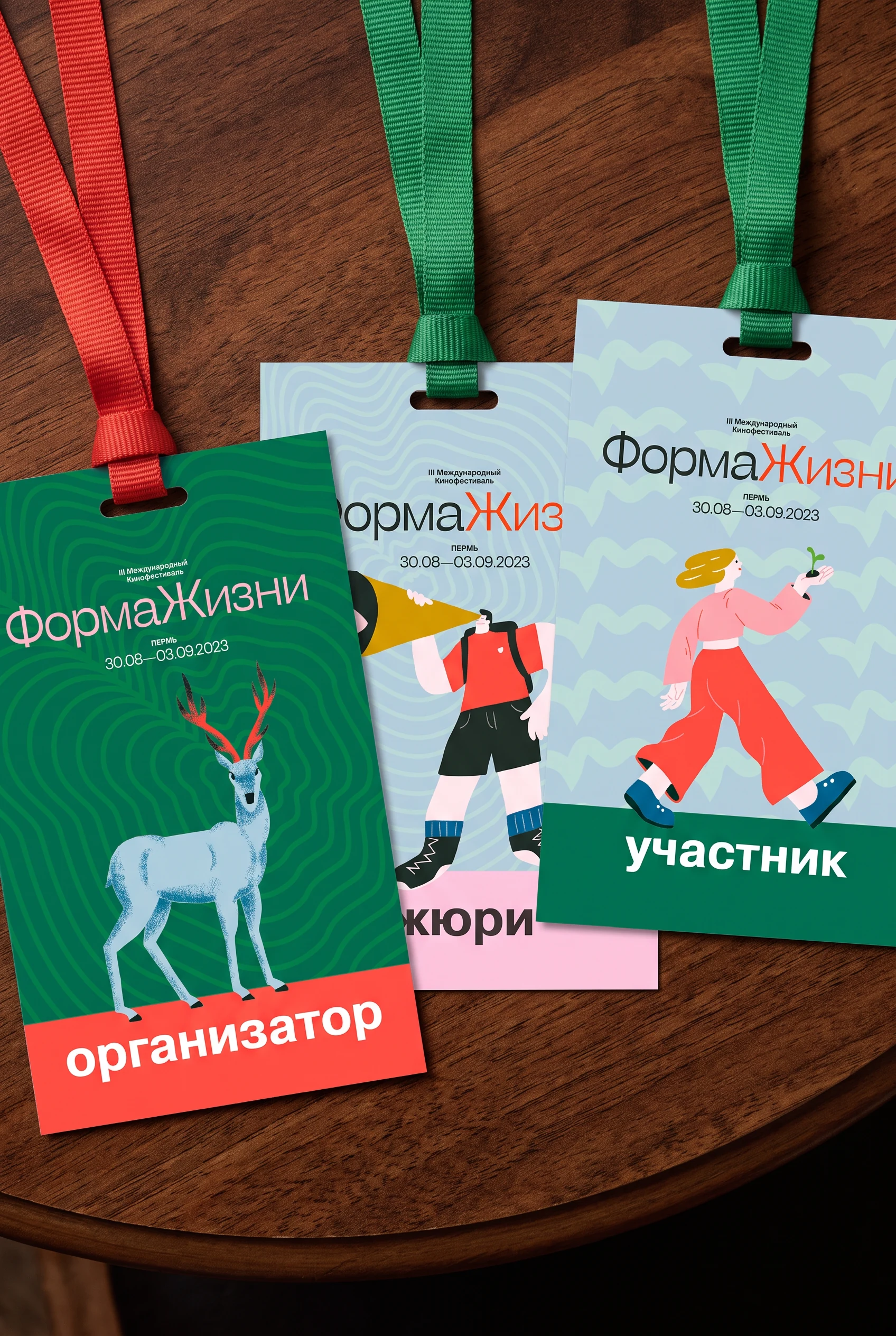
Three accreditation badges on lanyards — organiser, jury and participant — each on a different ground with its own painted figure.
Accreditation, third edition. Three tiers, three grounds, one construction.
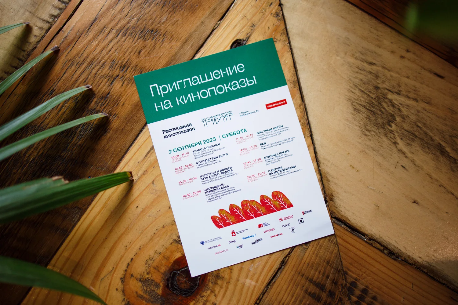
The printed screening invitation, mint green with a red schedule block, photographed on a wooden table.
Screening invitation. The small print is where a festival identity is actually tested.
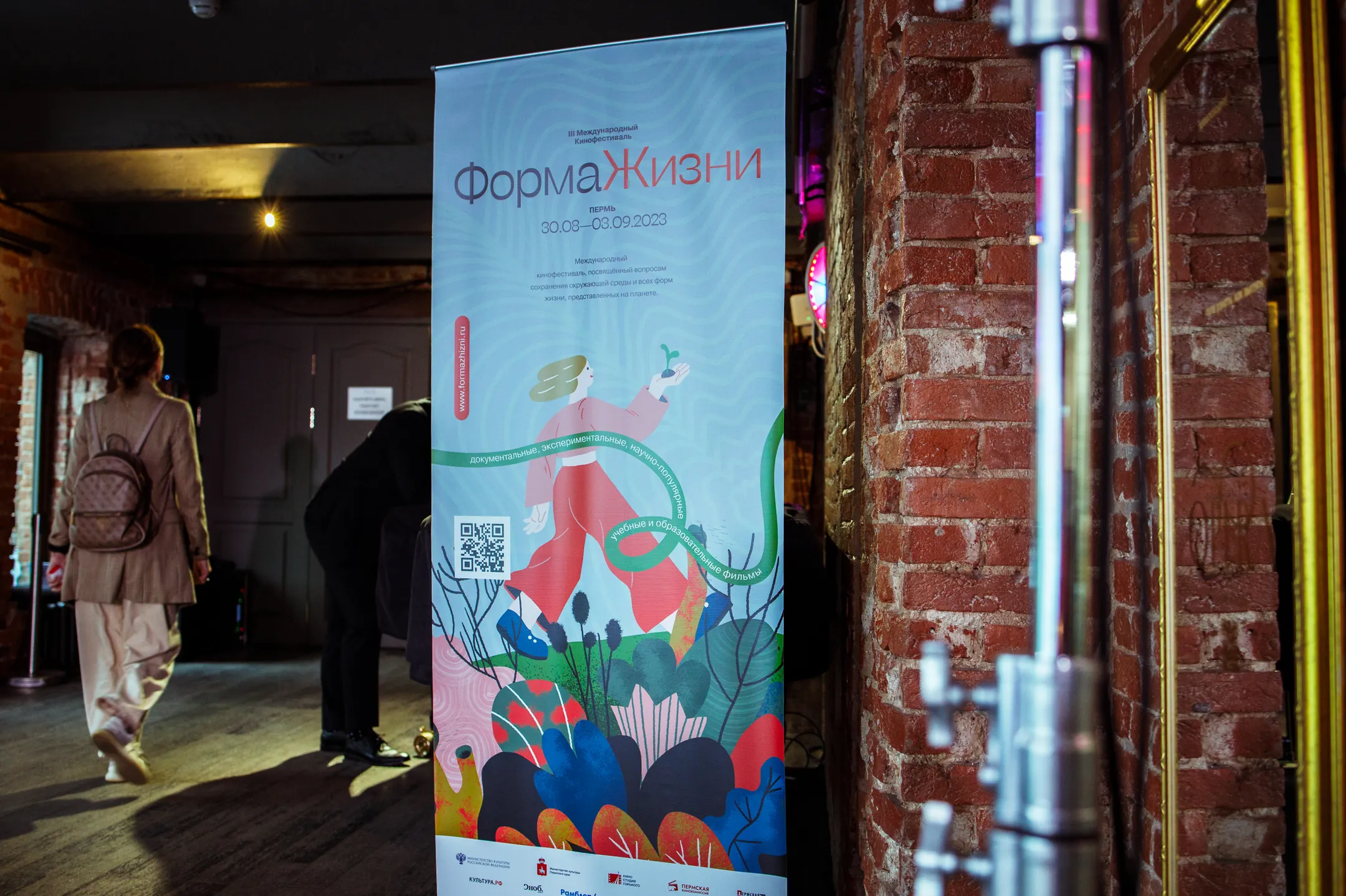
A festival roll-up banner in a dimly lit venue corridor with brick walls, a visitor walking past.
Roll-up in the venue corridor.
Moscow · 2024 · proposal, not produced

The fourth edition that did not happen

Shown here as a design proposal. The Moscow edition was developed but never ran — the funding did not come together.

The brief was a move to Moscow and a broader, more general audience. The identity was re-cut for it: a lighter condensed display face, flat gouache illustration in place of painting, and a single saturated ground with the mark reversed out of it. The wordmark and the one-body construction stayed, as they had for three years before.
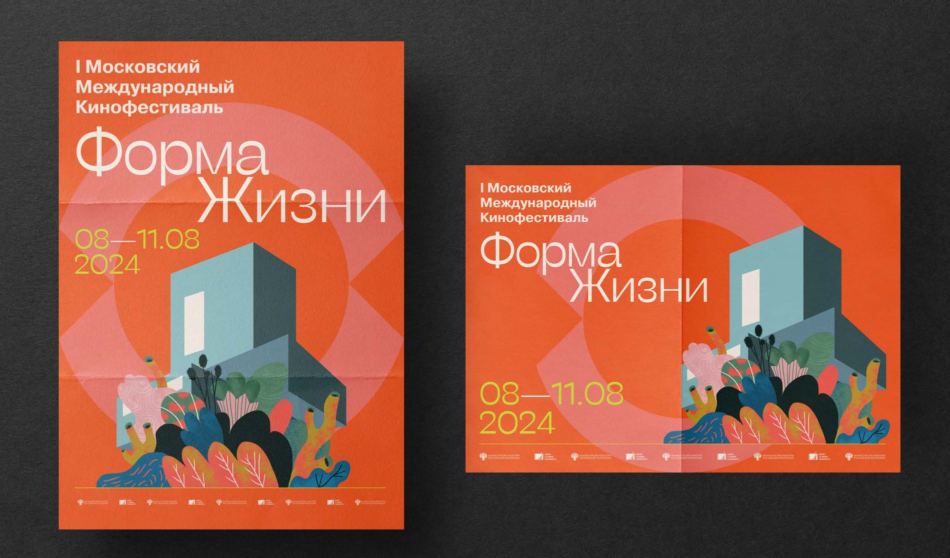
The unrealised 2024 Moscow proposal: poster and folded format, a flat gouache house and undergrowth on a vermilion ground with the wordmark reversed out in white.
Moscow proposal, 2024 — poster and folded format.

More work