Ten years of work that had to come back from a printer correct the first time — because there is no second print run.
Why this page exists
The case studies on this site are systems. This page is the other half of the job: printed objects made for four clients, each with one thing to get right.
A menu that gets handled by wet hands two hundred times a night. A wine label that has to survive a chiller and a fingernail. A film poster that has to work at A2 in a foyer and as a thumbnail on a phone. Each one is judged by a single question: did it come back from the printer right.
Gorky Film Studio
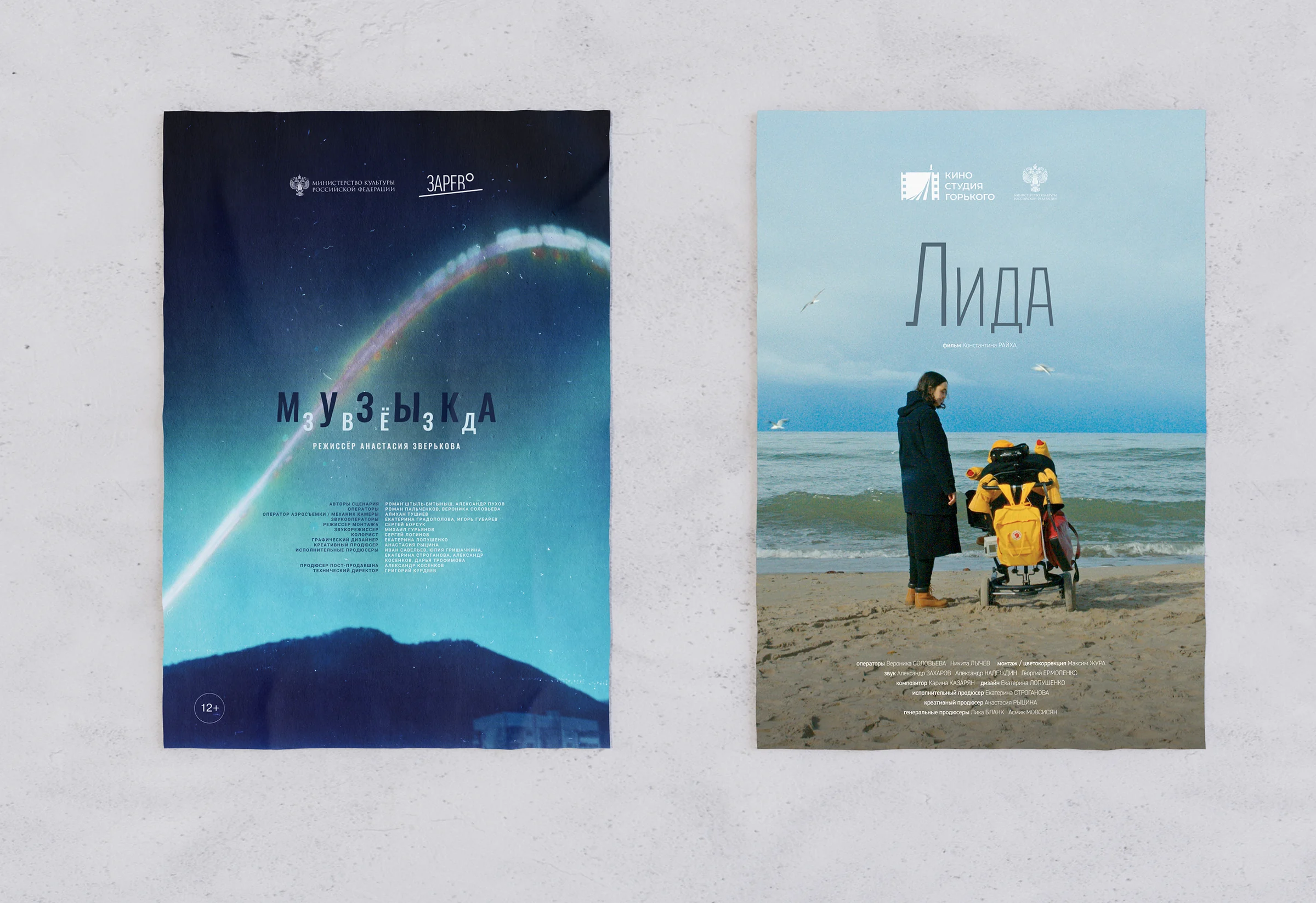
Poster design for documentary releases from the same studio behind the Shape of Life festival. A film poster is the one format where the image is not mine to choose — it arrives from the edit, and the job is to build a typographic structure that lets it breathe and still carries a title, a logo row and a rating.
On «Музыка» the title is spaced letter by letter across the horizon so the type behaves like the sound it names. On «Лида» the frame does all the work and the type gets out of the way entirely — a single word, set once, high on a pale sky.
A menu is handled two hundred times a night. It is the only design most restaurants own that customers physically hold.
Osteria Bianca
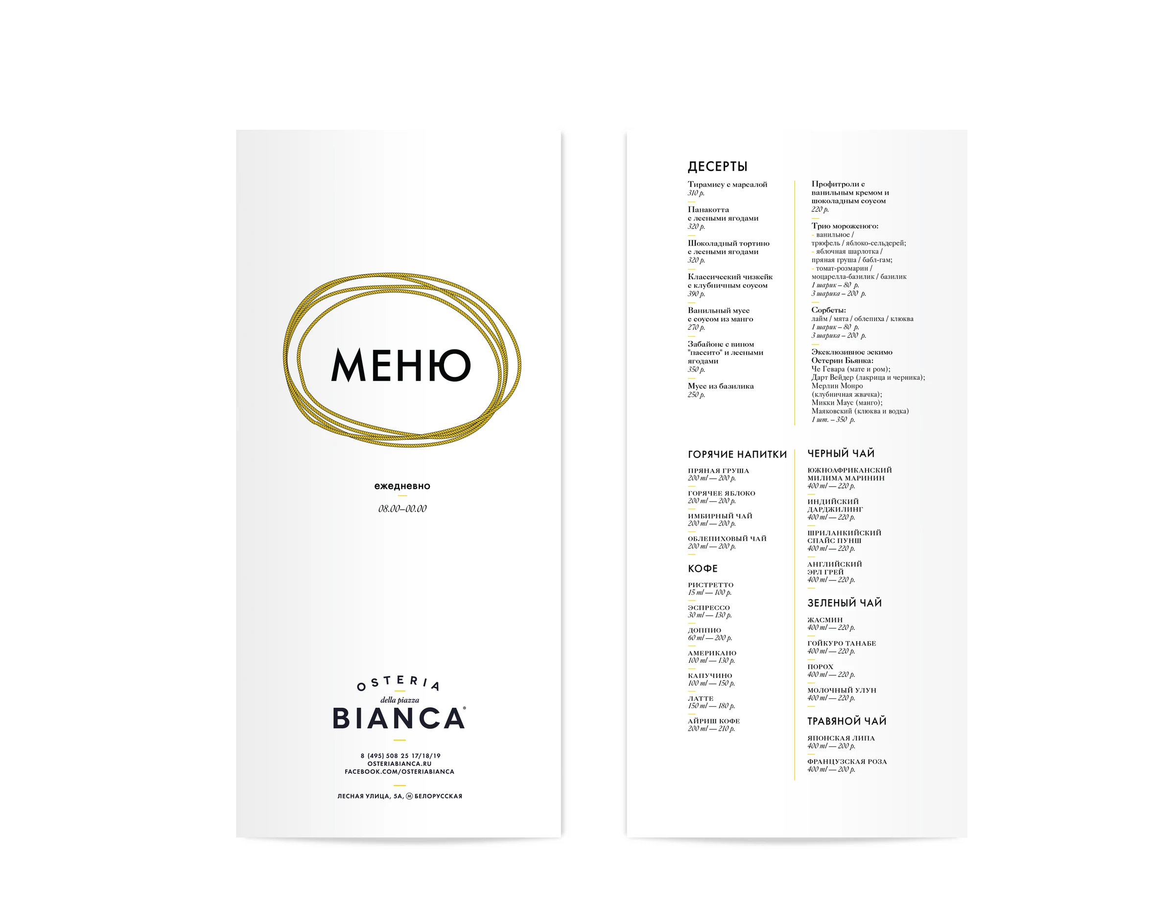
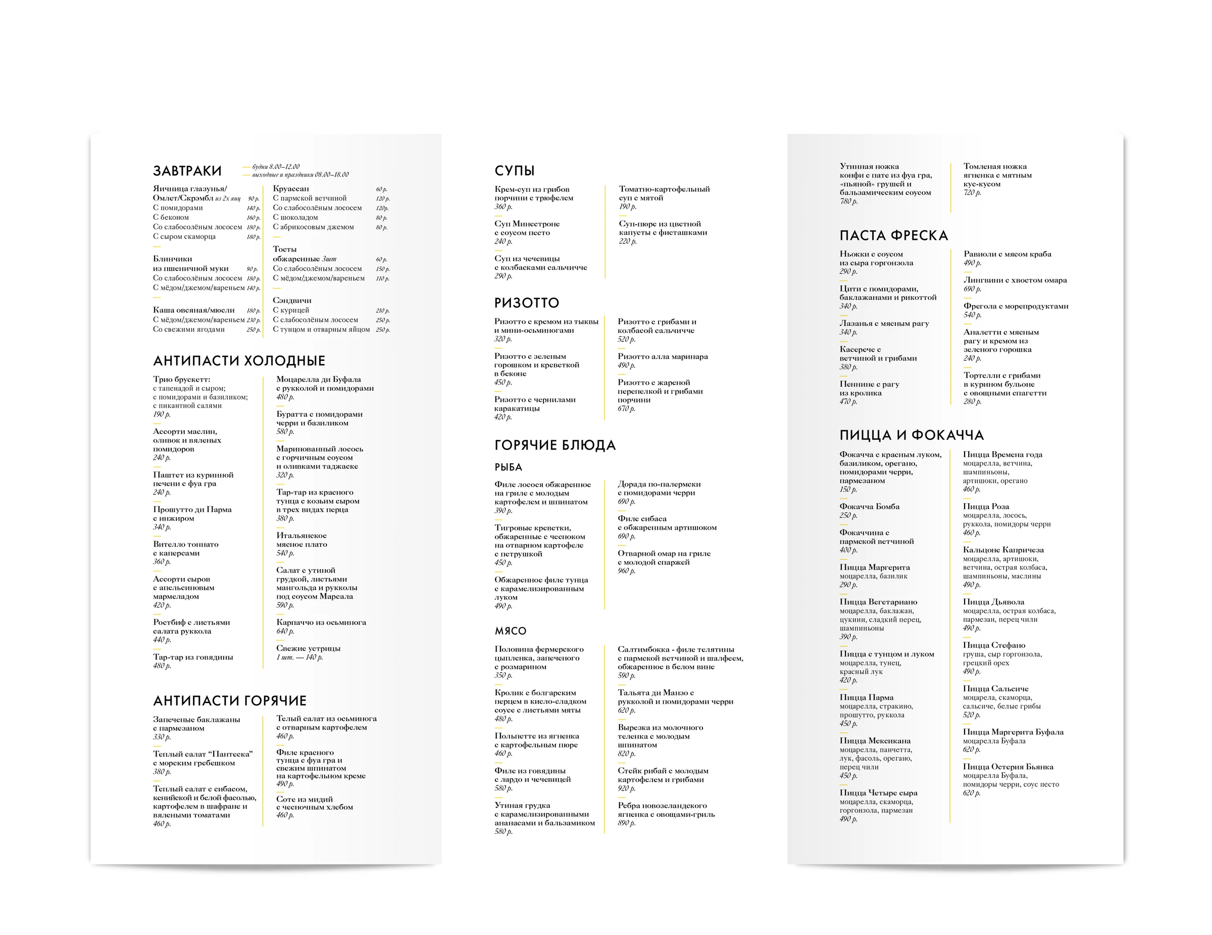
An osteria menu is a navigation problem before it is a typographic one: eight courses and sixty dishes have to fit one spread and still be scannable by candlelight. This one runs in fine columns with no boxes and no rules — a short yellow dash is the only separator, dish names bold, variants indented beneath them, prices in italic at the right edge. Everything else is alignment.
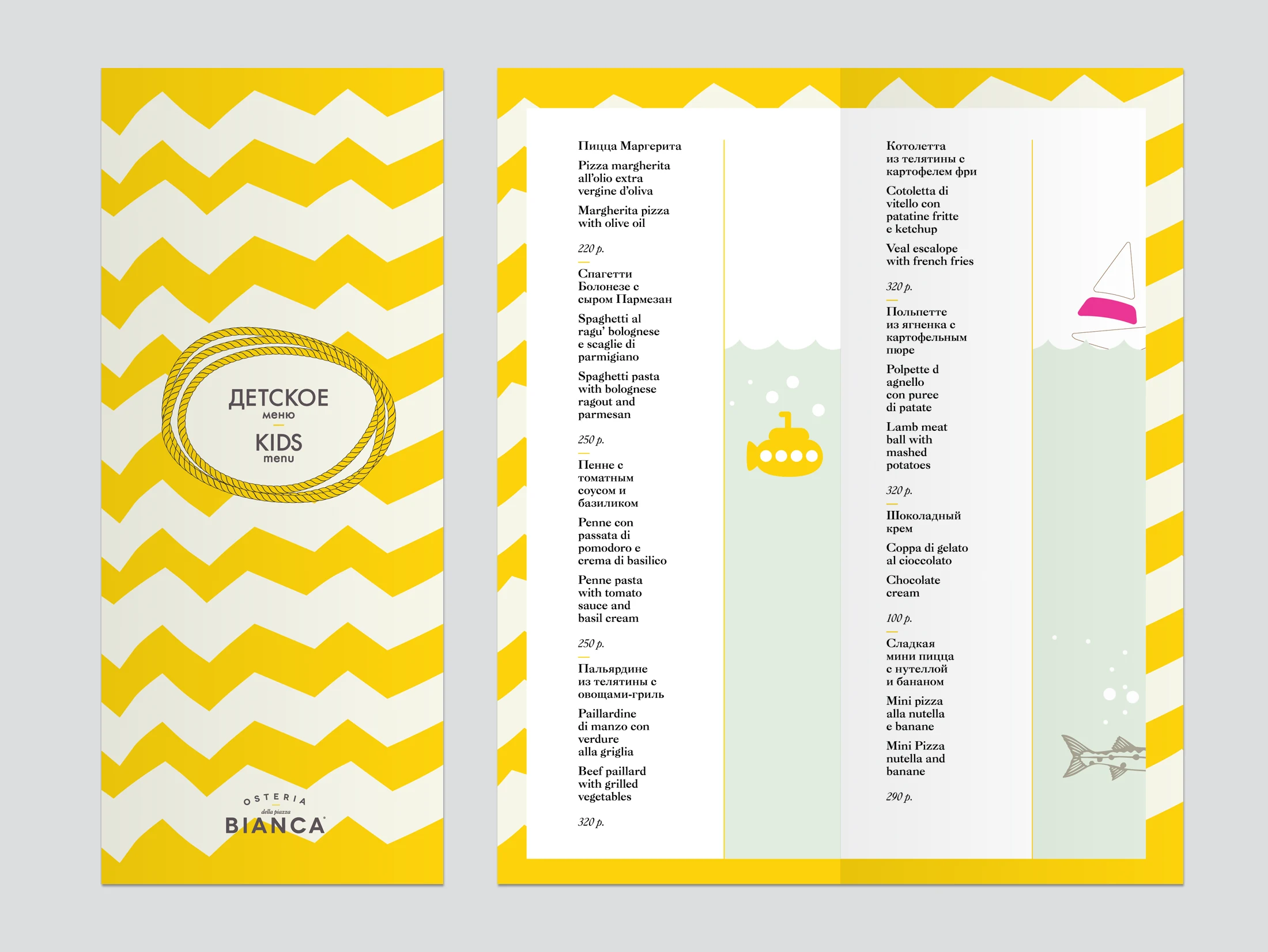
The kids' menu is the same restaurant at a different volume: a chevron cover, a submarine and a shark swimming up the price column, and — unlike the main menu — the Italian set under every Russian dish name, for parents reading out loud. It exists in two colourways, a mint one for the terrace and a yellow one for indoors.
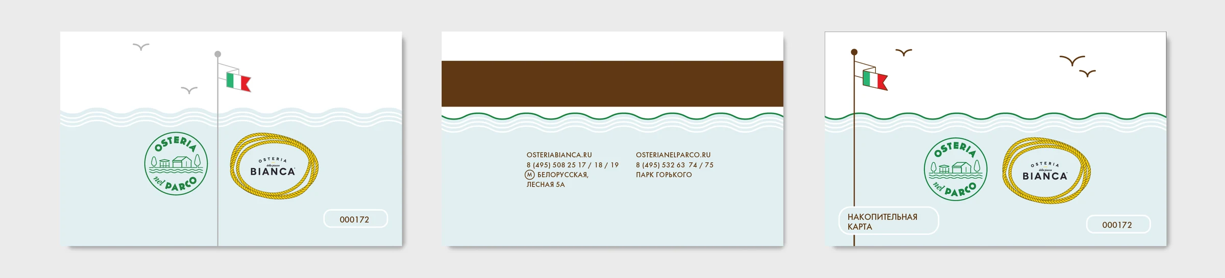
The loyalty card completes the set. Two restaurants share it — Osteria Bianca and Osteria nel Parco — so the card has to carry two marks without either one winning: the answer is a waterline that runs across the whole card, with both stamps sitting under it.
Globus Gourmet
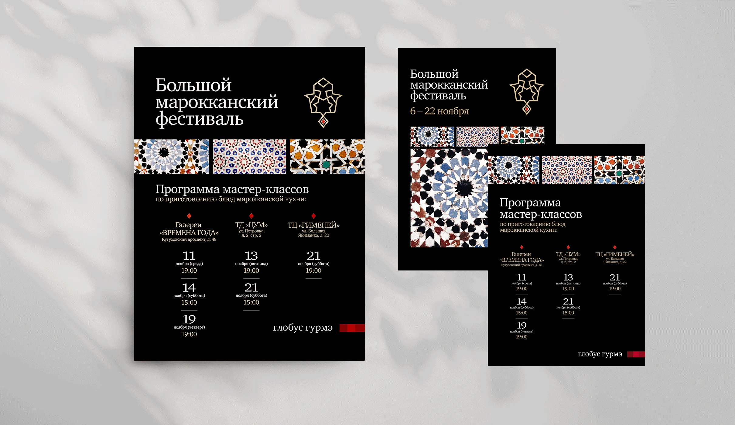
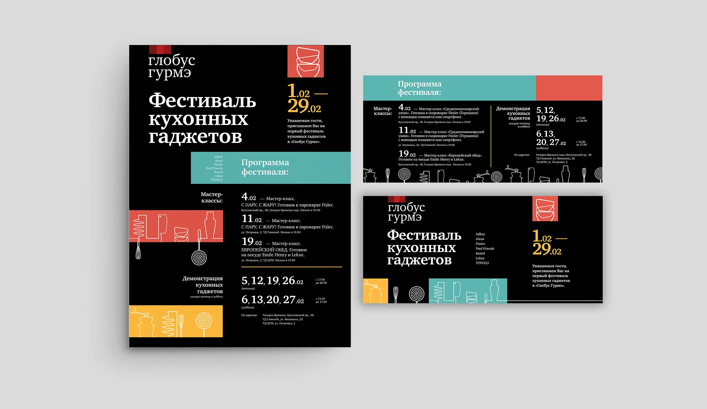
For a premium grocery chain, two in-store festivals a year needed campaign print: posters, programmes, shelf cards, window bills. Rather than design each one from nothing, the second reuses the first one's construction — black ground, the Globus Gourmet mark with its red square, a heavy title stacked at the top left, a band of subject graphic across the middle, and a dated masterclass programme set as a grid.
The Moroccan food festival fills that band with tile geometry; the kitchen gadget festival fills it with whisks, graters and jars drawn in a single-weight line on flat coral, teal and yellow. Anyone who saw the first one recognises the second, which is the whole point of a format.
Rutsog Inv.
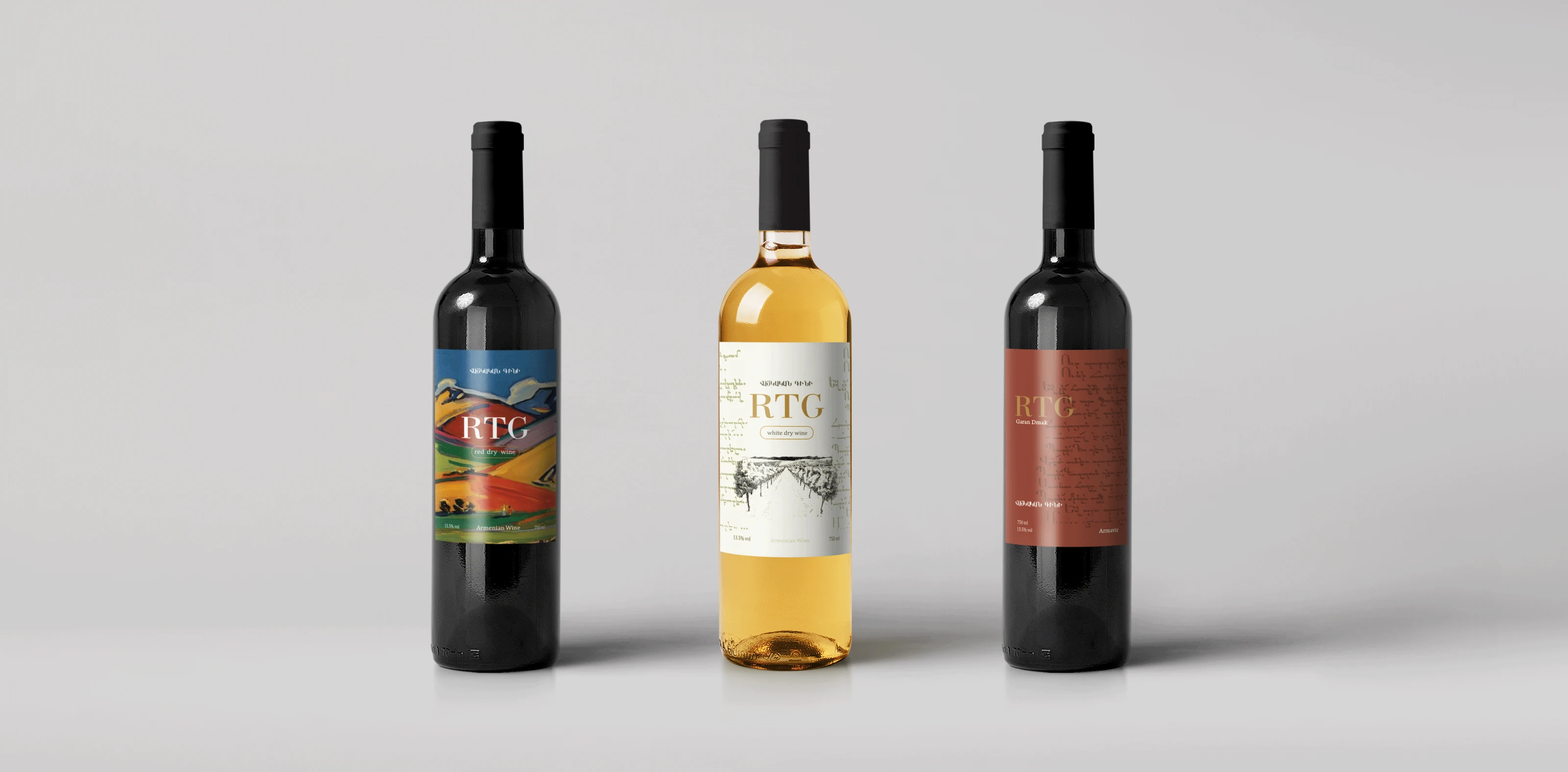
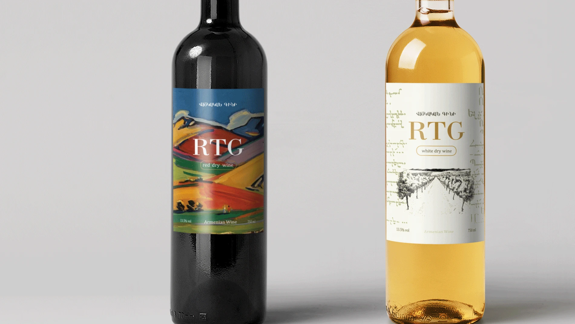
Two pieces from the property group, and the only packaging on this page. RTG is their Armenian wine — a red dry and a white dry, three labels on one layout. The monogram sits in the same place on every bottle and the artwork changes underneath it: a painted landscape for the red, an engraved vineyard for the white, bare terracotta for the third. A label is read at arm's length in bad light, so the mark is the only thing a buyer has to find twice.
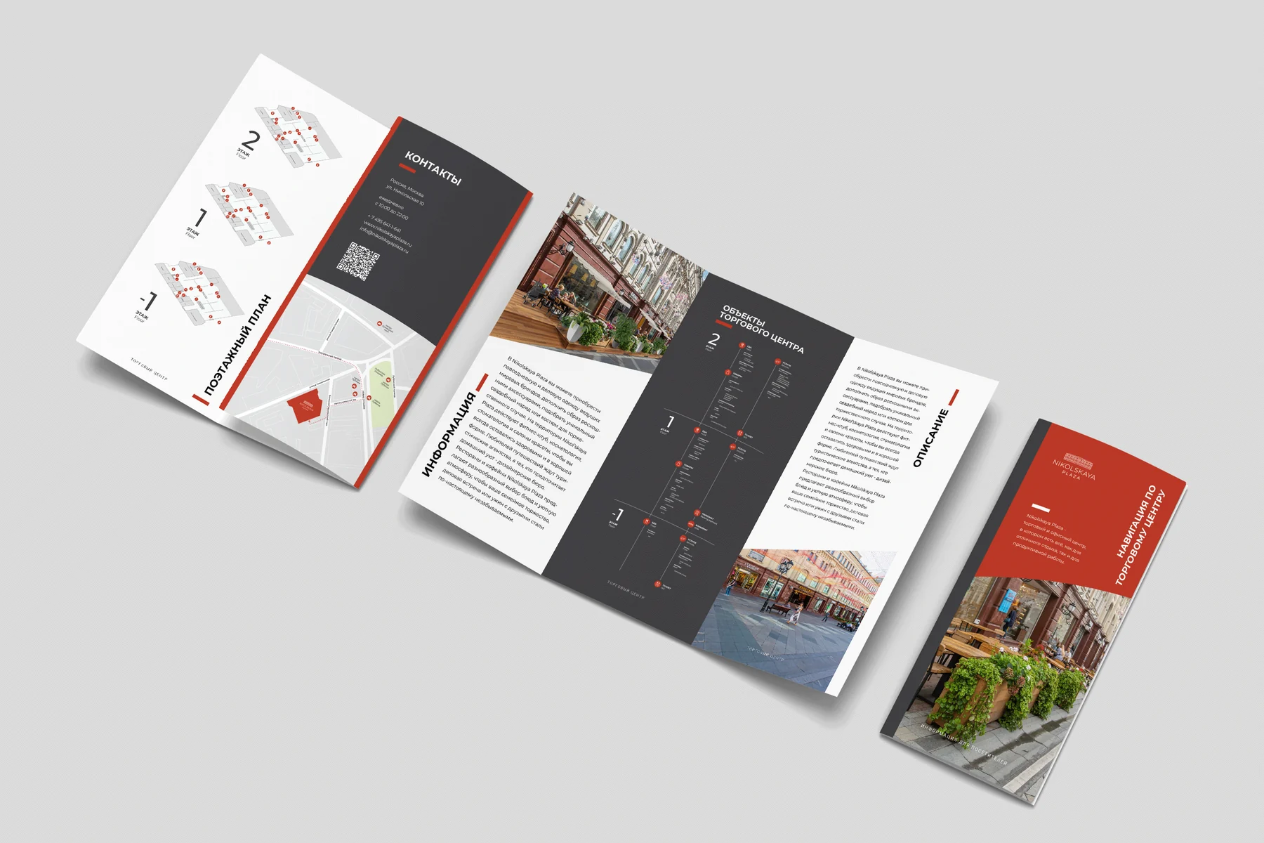
The leasing leaflet for Nikolskaya Plaza is the flat side of the same brand that later got the wayfinding system: an accordion fold carrying floor plans, photography and the tenant matrix in the same red and anthracite.
The common thread
Four clients, ten years, one shared condition: every object on this page was printed, folded, bound or applied to glass. That is a different discipline from screen work, and it is the part of the job I would not want to lose — colour that behaves on uncoated stock, a fold that lands on the right line, a spine width calculated from the actual paper.
More work