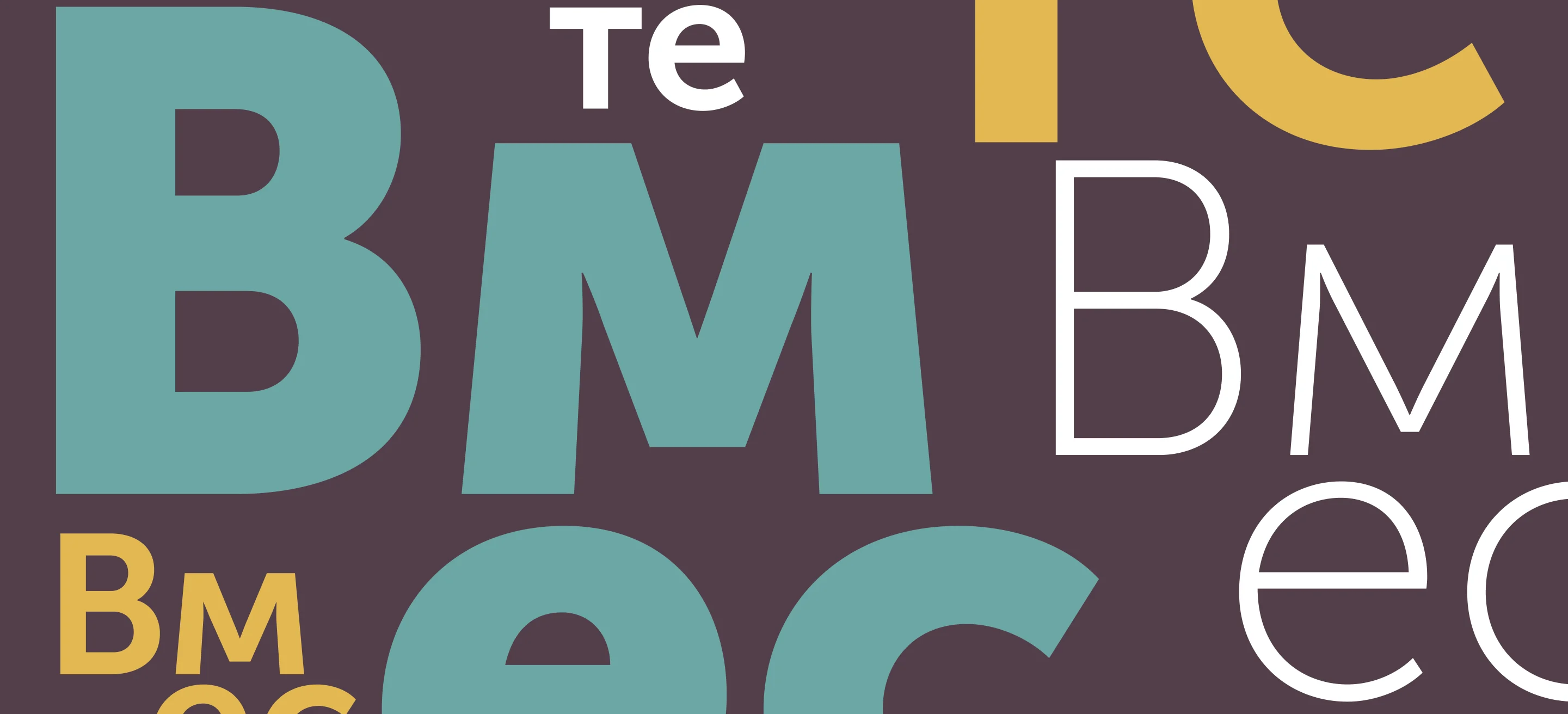
«Вместе» is Russian for together. It is set so that no two letters are the same size — and it still reads as one word.
The brief
Vmeste is an inclusive football programme: children with disabilities and children without them train and play in the same teams, on the same pitch, in the same kit.
It had to speak to two audiences who want opposite things from a piece of design. Parents, deciding whether this is a place they would leave their child — they need warmth and no condescension. Sponsors, deciding whether to fund a season — they need something that looks like a real club, not a cause.
Which ruled out both of the registers this category normally reaches for: the medical one, built out of wheelchair pictograms and ribbons, and the charitable one, built out of soft focus and cupped hands. Neither of those is what happens on a Saturday morning on a football pitch.
The idea
The name is stacked in three rows — Вм / ес / те — and nothing in it matches. The В is display-scale and heavy. The м is lighter and sits low. ес drops to another measure again; те starts smaller and grows into the row. No two characters share a size, a weight or a baseline, and there is no baseline they could share.
It is still, unmistakably, one word. That is the entire argument for inclusion, made in the construction of the mark instead of written on a line underneath it — and it is the one thing on the page that a seven-year-old and a sponsor both read the same way.
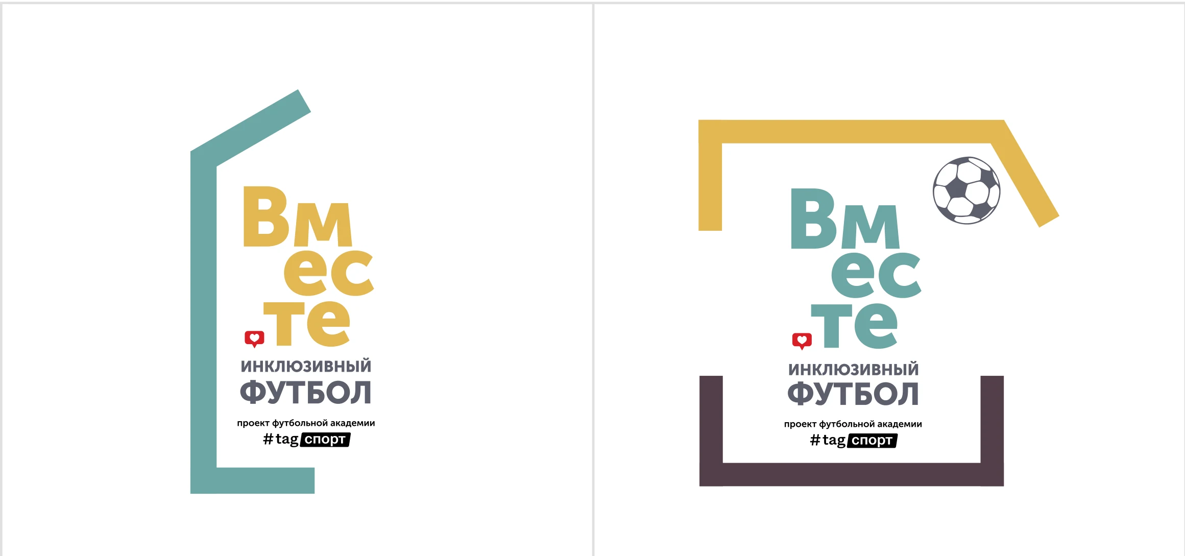
Under the name sit the only two lines that never change position: «инклюзивный футбол» and the academy endorsement. The full stop before те is a red heart in a speech bubble: a “like”, borrowed from the phone the parents are holding. It is the only warm mark in an otherwise structural logo, and it appears once per surface, never twice.
Nothing in the wordmark lines up. It reads as one word anyway.
The second idea
The tagline is «Футбол вне рамок» — football outside the frame. So the lockups put the wordmark inside a goal, and the goal is never finished: a post missing, a crossbar that stops short, the frame walking off the edge of the sheet.
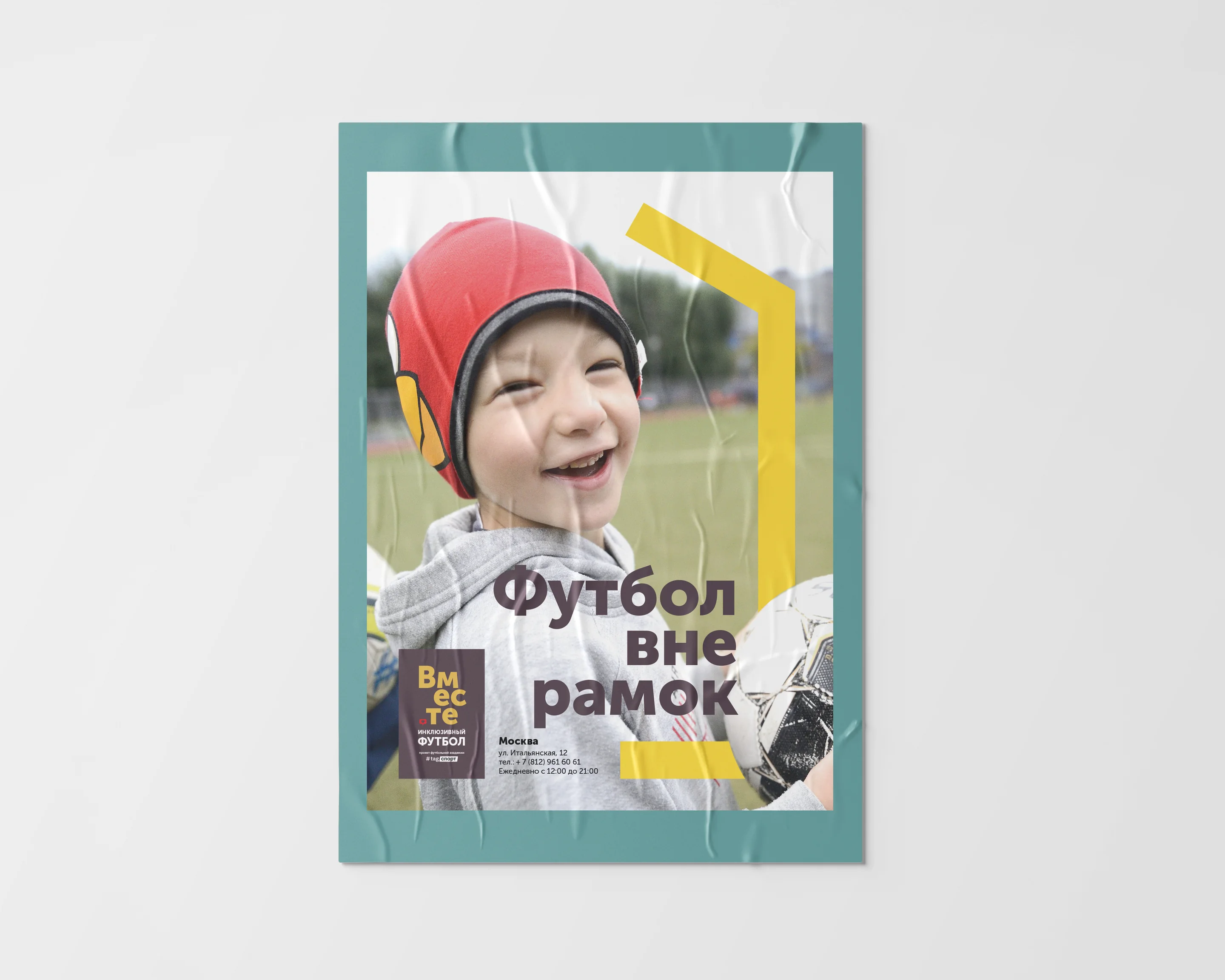
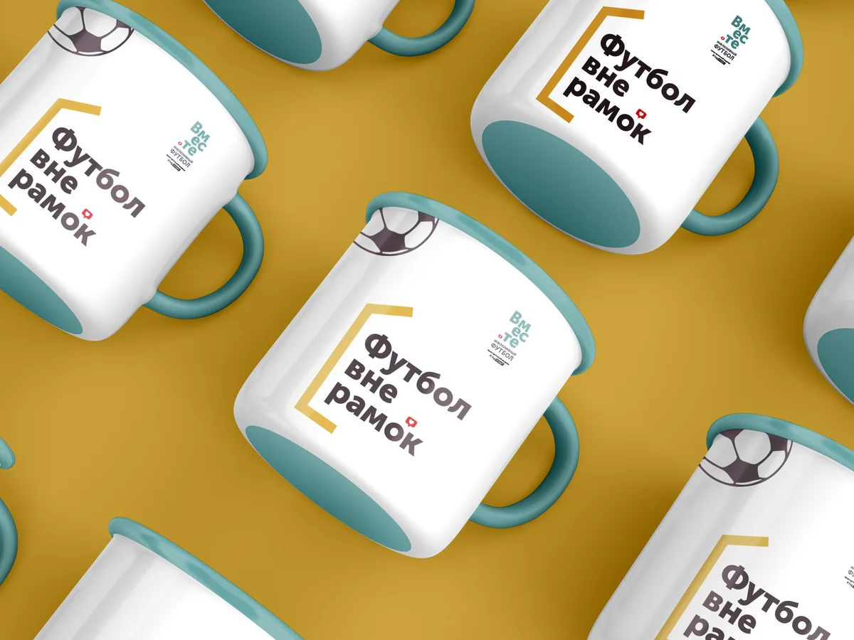
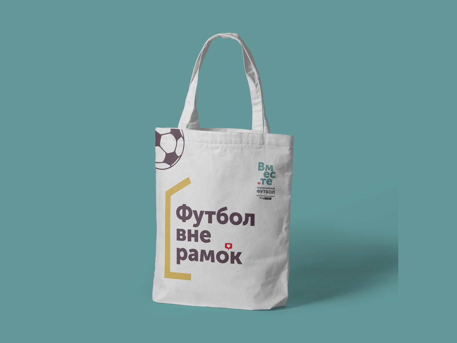
Across the whole set of applications it was never once drawn as a closed rectangle. On the poster the same open bracket crops the photograph rather than containing it; on the mug and the tote it opens to the right and simply runs out.
Palette
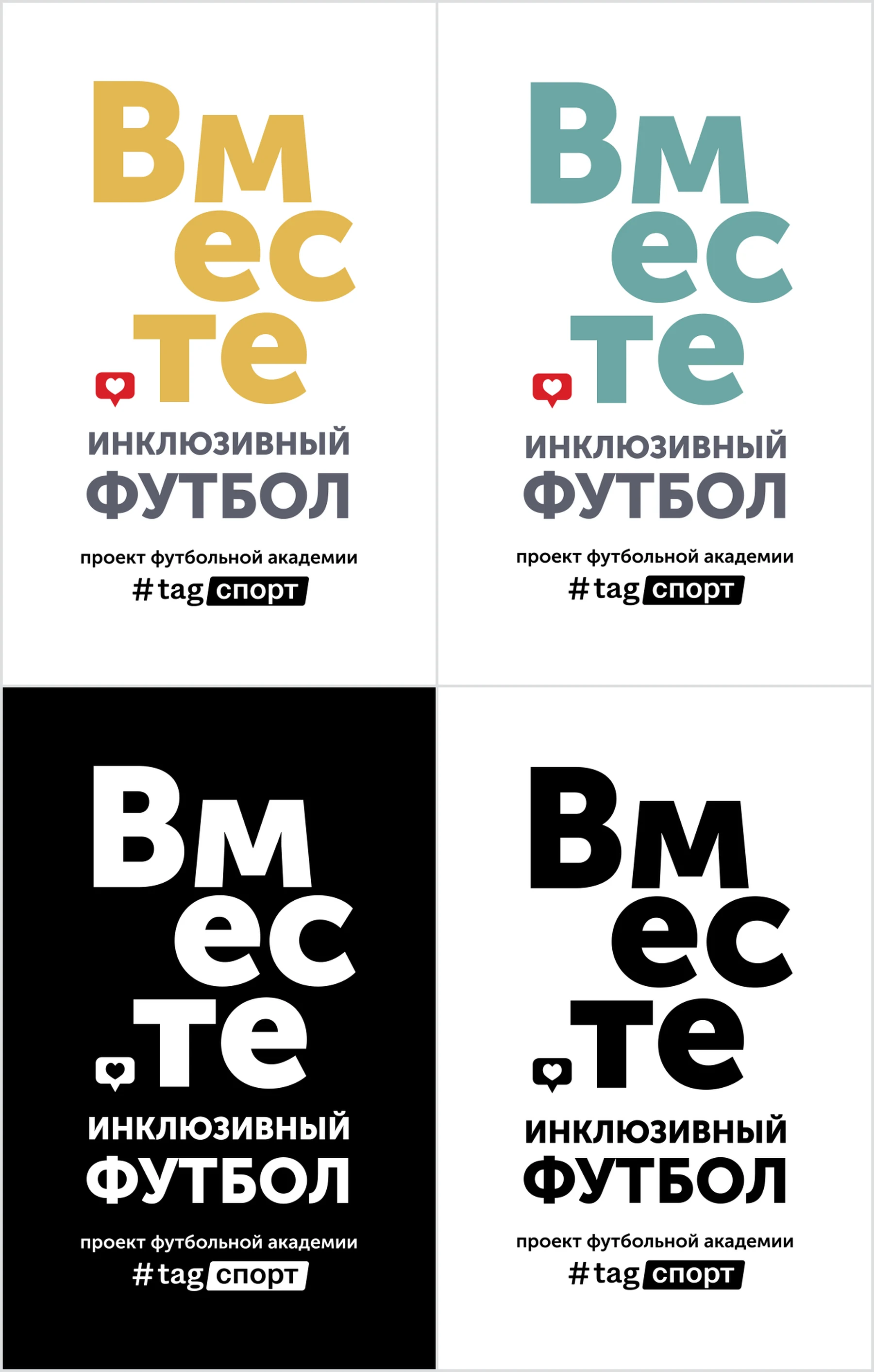
The ground is a deep plum rather than the institutional blue this category defaults to. Teal is the team colour and carries the name. Gold draws the goal and nothing else. Slate takes the secondary type, so the descriptor never competes with the mark. The red of the heart sits outside the palette: it is an accent, not a brand colour, and it appears once per surface.
The street
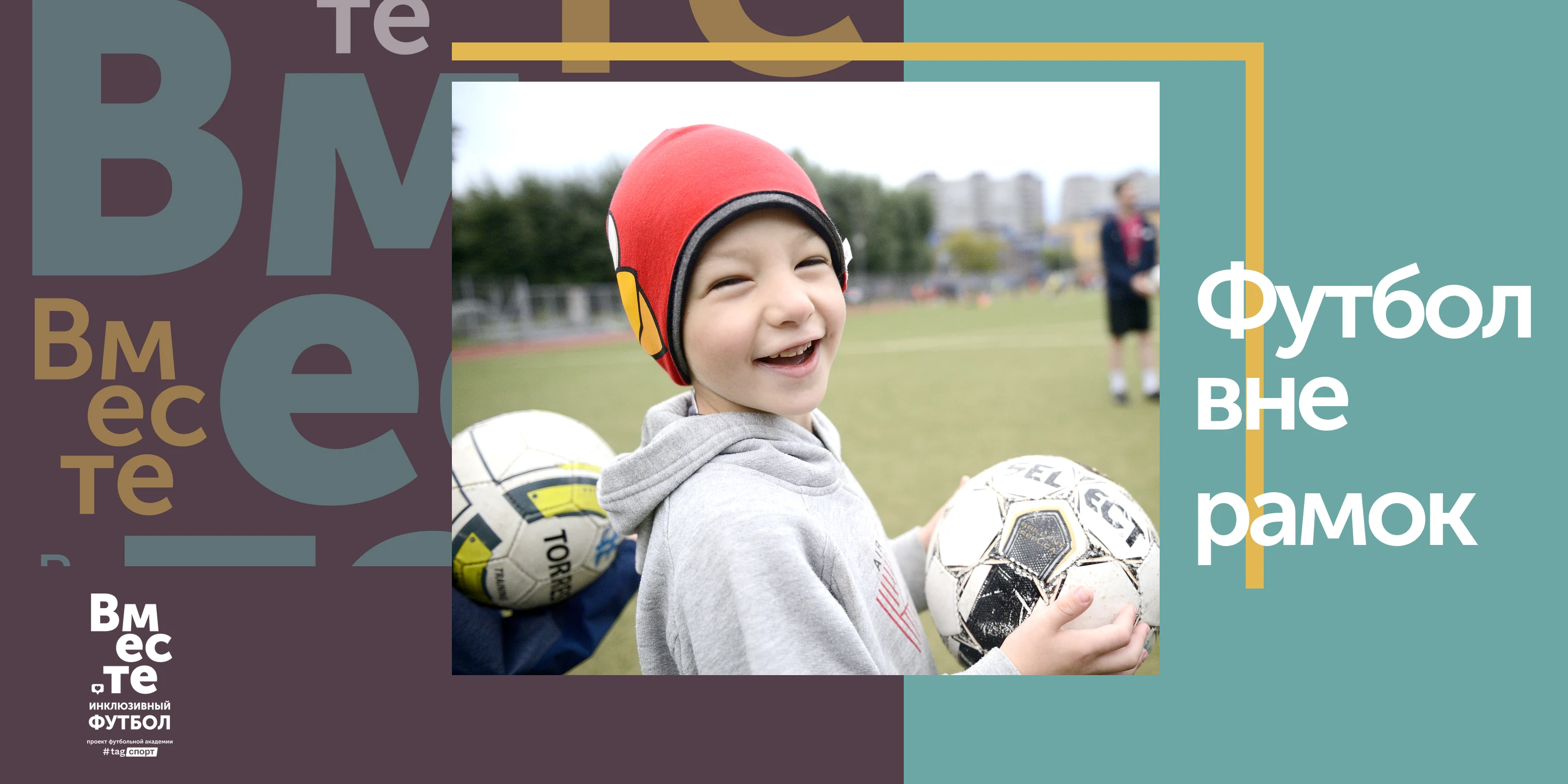
The poster runs a single photograph of a boy in a protective helmet, mid-laugh, holding two footballs — no caption explaining what he has, no line asking anyone for anything. The gold bracket cuts across the image instead of boxing it in, and the tagline sits in the corner where the frame has opened.
The same photograph carries the wide format. At banner proportions there is room for the pattern to run at full size on the left, so the word arrives as a crowd before the reader gets to the picture — and the goal frame, given more width, simply leaves the sheet rather than closing.
The book
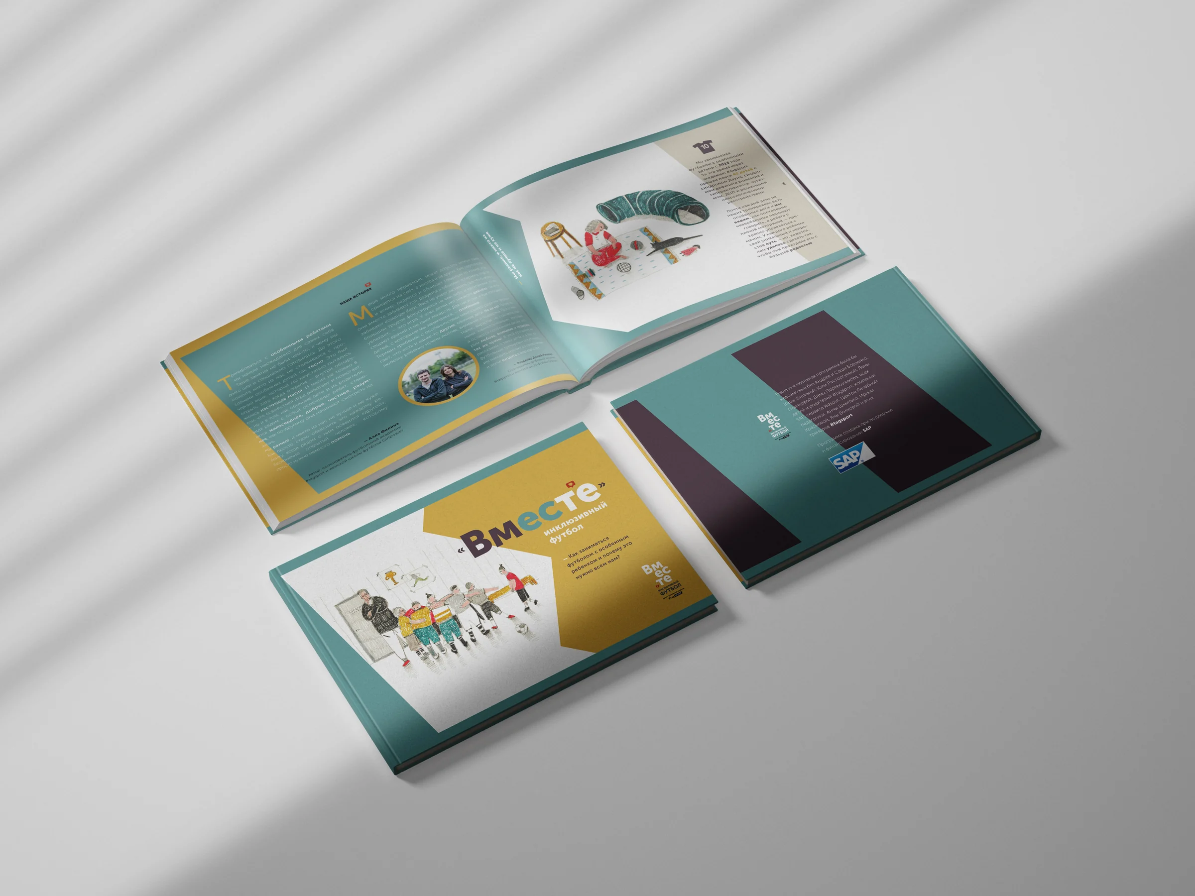
A landscape hardback for parents and coaches: «Как заниматься футболом с особенным ребёнком и почему это нужно всем нам» — how to do football with a special child, and why all of us need it. Produced with the support of SAP.
I commissioned the cover from Evgenia Strakhova with one instruction that mattered more than the subject: every child, whatever their height, kit or body, is drawn at exactly the same weight of line. Nothing is thickened to mark a difference and nothing is softened to excuse one — the same argument the wordmark makes, made again in a drawing. The result is a line of children across the cover, none of them the same and none of them emphasised. Inside, the teal and gold fields from the identity become the page structure, and the photography is of actual training sessions.
In hand
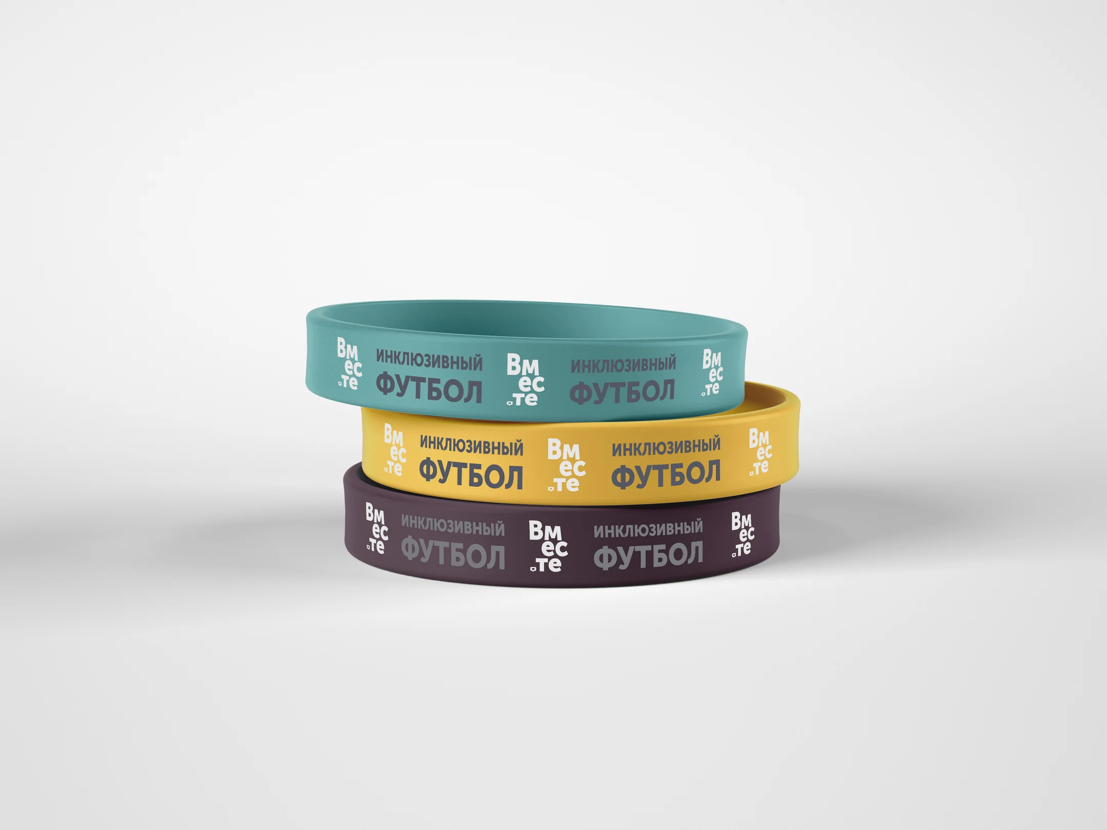
Enamel mugs, canvas totes and silicone wristbands in the three colours. The wristband is the hardest test in the system: forty millimetres of band, no images, and the mark still has to say the name and what it is. It is where the single-colour lockup earns its keep.
More work